


Fontke.com>Article>Details
Lichtenberger Backstube
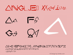
IntroductionPhoto: Florian Hardwig. License: All Rights Reserved.Daily horror


Photo: Florian Hardwig. License: All Rights Reserved.
Daily horror: A pointless jumble of insipid typefaces, words arranged on angles and arcs, letterforms stretched, squeezed and outlined. This is one of countless examples of store front signage that has been created without any sense of design. Not even Motter Femina – a quite nice and not so often seen typeface – can help.
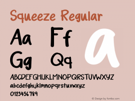
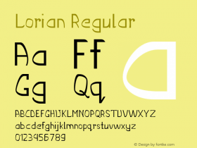
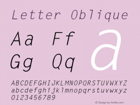
Relevant font family


Lichtenberger Backstube Comments
Lichtenberger Backstube Latest comments
No relevant comments
-
 ShanhaiFonts
Brand:山海字库
Area:China

-
 Cangji Fonts
Brand: 仓迹字库
Area: China
-
 JT Foundry
Brand: 翰字铸造
Area: Taiwan, China

-
 Handmadefont
Brand:
Area: Estonia

-
·千图字体
-
 HyFont Studio
Brand: 新美字库
Area: China


Recommended font article
- ·20 Houses. A New Residential Landscape exhibition, Wallpaper* Architects Directory
- ·Alphabet Stories by Hermann Zapf
- ·Statement and Counter-Statement, Automatically Arranged Alphabets, and Arts/Rats/Star
- ·Linotype Ad: "Linotype vs. Intertype"
- ·Hollywood Star Matt Damon Wrote Better Chinese than Chinese Stars
- ·"Die Alpen – Vielfalt in Europa" stamp
- ·How to sell your typefaces
- ·The Form Book by Borries Schwesinger
- ·Ad for Vincebus Eruptum by Blue Cheer
- ·"Fantastic!" ad for Captain Fantastic & the Brown Dirt Cowboy by Elton John & Bernie Taupin