



Fontke.com>Article>Details
The New York Review of Books (cover redesigns)
IntroductionSource: http://mauricemeilleur.com.License: All Rights Reserved.M


Source: http://mauricemeilleur.com.License: All Rights Reserved.
Maurice Meilleur:
Personal project. I've been reading the NYRB for over twenty years, and I have never liked their covers; the magazine is so smart and their covers look they were pasted up in 15 minutes. I get tradition and all that, and perhaps they don't want the magazine to look slick. But still. 10.75 × 14.75in.

Source: http://mauricemeilleur.com.License: All Rights Reserved.

Source: http://mauricemeilleur.com.License: All Rights Reserved.
Relevant font family


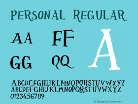
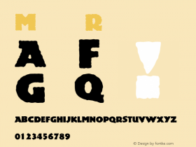

The New York Review of Books (cover redesigns) Comments
The New York Review of Books (cover redesigns) Latest comments
No relevant comments
-
 ShanhaiFonts
Brand:山海字库
Area:China

-
 Cangji Fonts
Brand: 仓迹字库
Area: China
-
 JT Foundry
Brand: 翰字铸造
Area: Taiwan, China

-
 Handmadefont
Brand:
Area: Estonia

-
·千图字体
-
 HyFont Studio
Brand: 新美字库
Area: China





Recommended font article
- ·"David Bowie is turning us all into voyeurs" button
- ·How to Read a Painting by Patrick de Rynck
- ·Jim Nutt: Coming Into Character at Museum of Contemporary Art Chicago
- ·Top 100 Fonts.com Web Fonts for May 2016
- ·Königsblut identity
- ·Surabaya Beat by Beat Presser, Afterhours Books
- ·Amazon Releases Ember Bold Font for the Kindle
- ·Ad for Vincebus Eruptum by Blue Cheer
- ·The Great Comic Book Heroes, by Jules Feiffer
- ·Make market-ready fonts with this 8 point checklist