



Think Quarterly


Source: http://www.thinkwithgoogle.co.uk.Google. License: All Rights Reserved.
Google's Think Quarterly is one of my favourite blog designs. Beautiful illustrations, crisp photography and, of course, Bell MT. This from Microsoft:
The original of this face was made 200 years ago and is thought by some to mark the introduction of the "modern" faces. It was made for Bell's Type Foundry by Richard Austin at about the time that the face we now know as Firmin Didot also appeared. Bell did not have a bold weight at that time. This new TrueType version, made in 1992 by Monotype Typography, tries to emulate the roughness that they imagine characterized typefounding in the 1780s. The metal version was a favorite of many designers who used it to bring some character to the text they were printing.

Source: http://www.thinkwithgoogle.co.uk.License: All Rights Reserved.
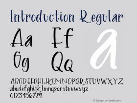
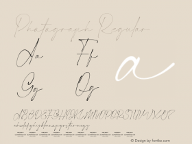
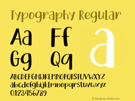
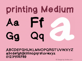

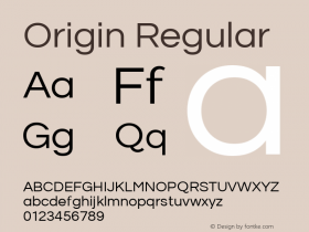
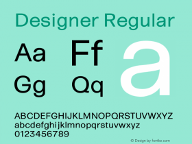
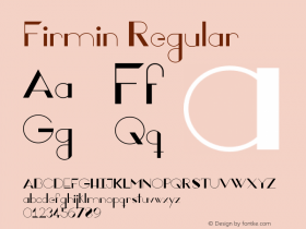
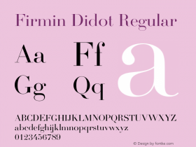



-
 ShanhaiFonts
Brand:山海字库
Area:China

-
 Cangji Fonts
Brand: 仓迹字库
Area: China
-
 JT Foundry
Brand: 翰字铸造
Area: Taiwan, China

-
 Handmadefont
Brand:
Area: Estonia

-
·千图字体
-
 HyFont Studio
Brand: 新美字库
Area: China


- ·Sinnesreize / Embracing Sensation by Silvia Gertsch and Xerxes Ach
- ·Chinese College Student Invents Smog Font
- ·Ad for Vincebus Eruptum by Blue Cheer
- ·Königsblut identity
- ·Amazon Releases Ember Bold Font for the Kindle
- ·Type terms: the animated typographic cheat sheet
- ·New York New York, Jazz St. Louis
- ·Linotype Ad: "Linotype vs. Intertype"
- ·Barbe à papa Cotton Candy
- ·Alphabet Stories by Hermann Zapf