



Customer Spotlight: Intel
Founded in 1968, Intel has been at the forefront of technology development for over 40 years. The company brought the first microprocessor to market in 1971, and continues to be a leader in computing technologies today.
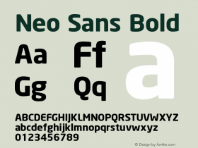
The Intel website features a customized version the Neo Sans typeface family exclusively, employing light, regular, and medium weights. While a typeface sharing the DNA of both a square and geometric sans might, at first blush, seem detrimental to readability, the use of multiple weights stages a dynamic and pleasant visual hierarchy.
In terms of the aesthetics of the letterforms, Sebastian Lester—who designed the Neo Sans family in 2004—characterizes the typeface as "legible without being neutral, nuanced without being fussy and expressive without being distracting."
You can certainly appreciate that sentiment while browsing through the many layers of Intel's website; the Neo Sans typeface family provides subtle cues of the ever-forward mission of the company without seeming like visual hyperbole.
Featuring a robust selection, also including bold, black, and ultra weights, Neo Sans is available in 24 varieties through the Fonts.com Web Fonts service.




-
 ShanhaiFonts
Brand:山海字库
Area:China

-
 Cangji Fonts
Brand: 仓迹字库
Area: China
-
 JT Foundry
Brand: 翰字铸造
Area: Taiwan, China

-
 Handmadefont
Brand:
Area: Estonia

-
·千图字体
-
 HyFont Studio
Brand: 新美字库
Area: China


- ·Alibaba Supports Font Infringement Complaints
- ·The Great Comic Book Heroes, by Jules Feiffer
- ·MC5 – Back in the USA album cover
- ·Japanese Typography Writing System
- ·Top 100 Fonts.com Web Fonts for May 2016
- ·How to sell your typefaces
- ·47 free tattoo fonts for your body art
- ·Moving Hands (Helena Hauff Remix) by The Klinik, official video
- ·Surabaya Beat by Beat Presser, Afterhours Books
- ·Quimbaya Coffee Roasters