


Fontke.com>Article>Details
谷歌引入新“Literara”字体 让电子书变得更漂亮
Introduction相比较上网冲浪,在阅读电子书籍的过程中我们对字体有着更高的要求。根据Google Play最新推文显示,谷歌将会为Google P
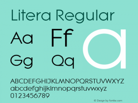
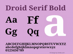
相比较上网冲浪,在阅读电子书籍的过程中我们对字体有着更高的要求。根据Google Play最新推文显示,谷歌将会为Google Play Books推出全新字体--“Literara”。这意味着当用户通过这项服务来阅读电子书籍的时候能够看到这个新字体,根据预览显示效果相当不错,它将替代现有的Droid Serif字体。
援引外媒9to5Mac报道称谷歌事实上在本月早些时候更新的3.4.5版本Google Play Books应用中首次引入了这个全新的字体,只是现在决定让更多的人知道这个消息,谷歌表示新字体更利于长时间阅读。
下面为Literara,上面为Droid Serif字体
Relevant font family
谷歌引入新“Literara”字体 让电子书变得更漂亮 Comments
谷歌引入新“Literara”字体 让电子书变得更漂亮 Latest comments
No relevant comments
-
 ShanhaiFonts
Brand:山海字库
Area:China

-
 Cangji Fonts
Brand: 仓迹字库
Area: China
-
 JT Foundry
Brand: 翰字铸造
Area: Taiwan, China

-
 Handmadefont
Brand:
Area: Estonia

-
·千图字体
-
 HyFont Studio
Brand: 新美字库
Area: China


Recommended font article
- ·The Future of Sex poster
- ·Iconic Transport for London logo undergoes subtle redesign
- ·"Fantastic!" ad for Captain Fantastic & the Brown Dirt Cowboy by Elton John & Bernie Taupin
- ·Moving Hands (Helena Hauff Remix) by The Klinik, official video
- ·Japanese Typography Writing System
- ·Chinese College Student Invents Smog Font
- ·Food Not Bombs hypothetical redesign
- ·London Underground's iconic Johnston Sans typeface
- ·Amazon Releases Ember Bold Font for the Kindle
- ·Top 100 Fonts.com Web Fonts for May 2016