


Fontke.com>Article>Details
"Matthew Barney: Drawing Restraint" at SFMOMA
IntroductionSource: http://www.flickr.com.Uploaded to Flickr by Stephen Coles


Source: http://www.flickr.com.Uploaded to Flickr by Stephen Coles and tagged with "itcfranklingothic". License: CC BY-NC-SA.
Predictably, my favorite part of the Drawing Restraint exhibition was the one with the most text on the wall: the explanation room.
SFMOMA's gallery designers do exquisite work. All the type is readable, regardless of the distance from the viewer. And it's always understated, but appropriate for the exhibition.
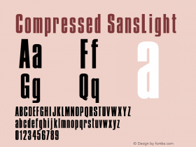
Font: ITC Franklin Gothic Compressed Demi and hyper-obliqued for the show title.

Source: http://www.flickr.com.License: All Rights Reserved.
Relevant font family


Relevant font designer

"Matthew Barney: Drawing Restraint" at SFMOMA Comments
"Matthew Barney: Drawing Restraint" at SFMOMA Latest comments
No relevant comments
-
 ShanhaiFonts
Brand:山海字库
Area:China

-
 Cangji Fonts
Brand: 仓迹字库
Area: China
-
 JT Foundry
Brand: 翰字铸造
Area: Taiwan, China

-
 Handmadefont
Brand:
Area: Estonia

-
·千图字体
-
 HyFont Studio
Brand: 新美字库
Area: China


Recommended font article
- ·Moving Hands (Helena Hauff Remix) by The Klinik, official video
- ·Cher Got Sued For Font!
- ·MC5 – Back in the USA album cover
- ·The Form Book by Borries Schwesinger
- ·Why Apple Abandoned the World's Most Beloved Typeface?
- ·He Invented a Font to Help People With Dyslexia Read
- ·How to sell your typefaces
- ·"David Bowie is turning us all into voyeurs" button
- ·The Future of Sex poster
- ·XUID Arrays: One Less Thing To Worry About