



ICA Paper Bag


Photo by Claes Källarsson.
With our appetite for European supermarkets still lingering, here's a lighter morsel for your Friday. As a temporary Stockholm resident I was often impressed with the food packaging and presentation in Swedish grocery stores. This piece, picked up by our friend Claes Källarsson in Sundsvall, perfectly illustrates the kind of clean and pleasant typography and illustration that is typical of Nordic package design. It's a paper bag from ICA, used for mushrooms and any other fresh produce you don't want to put in a plastic bag.


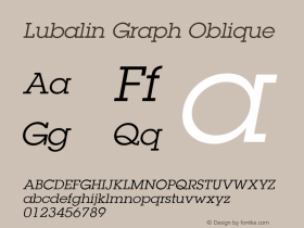
The folksy type (Swedish for "newly harvested") looks old fashioned, but it's actuallyITC Lubalin Graph. The designers cleverly nicked the serifs, mimicking the bifurcated Tuscan style that was common in 19th century display typography and often found in wooden fonts and traditional baseball logos (Red Sox, Mets).
For more Tuscan type in this pared down mode with minimal ornamentation, take a gander at Dekoria, ITC Buckaroo, URW Wood Type, PL Davison Americana, and Davison Baroque.



-
 ShanhaiFonts
Brand:山海字库
Area:China

-
 Cangji Fonts
Brand: 仓迹字库
Area: China
-
 JT Foundry
Brand: 翰字铸造
Area: Taiwan, China

-
 Handmadefont
Brand:
Area: Estonia

-
·千图字体
-
 HyFont Studio
Brand: 新美字库
Area: China





- ·How House Industries Designs Its Retrotastic Logos and Typefaces
- ·Troubadour poster, Opera Plovdiv
- ·Barbe à papa Cotton Candy
- ·Cher Got Sued For Font!
- ·He Invented a Font to Help People With Dyslexia Read
- ·Chinese College Student Invents Smog Font
- ·"Die Alpen – Vielfalt in Europa" stamp
- ·Make market-ready fonts with this 8 point checklist
- ·Quimbaya Coffee Roasters
- ·Iconic Transport for London logo undergoes subtle redesign