


Fontke.com>Article>Details
Typographic logo redesign
IntroductionAmazing to see how tiny (ok, maybe not tiny, let's say subtle) di
Amazing to see how tiny (ok, maybe not tiny, let's say subtle) differences in font design can have a huge impact. The added terminals and other little changes make the type of this logo look much smoother, soft and welcoming. I'm not sure the color chosen on the cover and the use of the logo full width are very appropriate though. Via BrandNew.
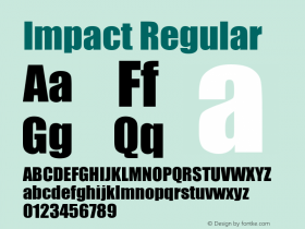
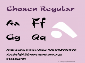
Relevant font family


Typographic logo redesign Comments
Typographic logo redesign Latest comments
No relevant comments
-
 ShanhaiFonts
Brand:山海字库
Area:China

-
 Cangji Fonts
Brand: 仓迹字库
Area: China
-
 JT Foundry
Brand: 翰字铸造
Area: Taiwan, China

-
 Handmadefont
Brand:
Area: Estonia

-
·千图字体
-
 HyFont Studio
Brand: 新美字库
Area: China


Recommended font article
- ·The Future of Sex poster
- ·Iconic Transport for London logo undergoes subtle redesign
- ·"Fantastic!" ad for Captain Fantastic & the Brown Dirt Cowboy by Elton John & Bernie Taupin
- ·Moving Hands (Helena Hauff Remix) by The Klinik, official video
- ·Japanese Typography Writing System
- ·Chinese College Student Invents Smog Font
- ·Food Not Bombs hypothetical redesign
- ·London Underground's iconic Johnston Sans typeface
- ·Amazon Releases Ember Bold Font for the Kindle
- ·Top 100 Fonts.com Web Fonts for May 2016