


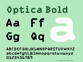
Figuring It Out: OSF, LF, and TF Explained
Numerals (or figures) can take various forms. The figure style you choose ought to be appropriate to the project you are working on. Readability is key. But which style is best for which purpose? There are two main forms,oldstyle figures(OSF) andlining figures(LF). Each can come in tabular and proportional widths. See some examples above.
Oldstyle Figures
Oldstyle figures are Arabic numerals varying in height and position. Some sit on the baseline while others descend beneath the baseline. The 6 and 8 are commonly the tallest figures and the 3,4,5,7, and 9 descend below the baseline, while the 0, 1, and 2 are roughly the same height of the lowercase letters. This feature allows them to harmonize with other words on a page of text without becoming a distraction to the reader. So oldstyle figures are most appropriate in books or any running text. Oldstyle figures are also known as non-aligning figures, text figures or oldstyle numerals.
Lining Figures
Lining figures are derived from oldstyle figures. They are a modern style with all figures at a common size and position and even height as the uppercase letters (but sometimes smaller and lighter than the capitals). Today, most fonts use these as default. Lining figures sit on the baseline as opposed to oldstyle figures that appear at different heights and positions. They optically align along a height line and the baseline. The best applications are business reports, forms, tables or any place where alignment is crucial. Lining figures are also known as regular numerals or titling figures.
Tabular Figures
Tabular figures are mono-width, they align vertically and thus appear in documents that compare numerical data in columns. Each figure shares the same width and space on both sides.
Proportional Figures
Proportional figures are different in their total character width. They are spaced to fit together more like letters. For instance, the figure 1 is very narrow like the letter l and takes up less width than the number 6. Because their spacing appears more even, these figures are best in texts and headings where columnar alignment is not necessary.
Now that you know the differences between the two figures styles and their two widths, you know what to buy for your particular needs. Fortunately, some foundries (like FontFont) make it simple: every figure style that has been designed for a particular typeface is included in each purchasable package. OpenType, though, makes it even simpler. Most OpenType fonts include all available figure styles within a single font. So there's no switching between fonts to get to the right figures. Read more about the conveniences of the format on our new OpenType page.
See also: Office FontFonts


-
 ShanhaiFonts
Brand:山海字库
Area:China

-
 Cangji Fonts
Brand: 仓迹字库
Area: China
-
 JT Foundry
Brand: 翰字铸造
Area: Taiwan, China

-
 Handmadefont
Brand:
Area: Estonia

-
·千图字体
-
 HyFont Studio
Brand: 新美字库
Area: China


- ·Iconic Transport for London logo undergoes subtle redesign
- ·Cher Got Sued For Font!
- ·Troubadour poster, Opera Plovdiv
- ·Bevésett nevek (Carved Names), vol. 2
- ·Statement and Counter-Statement, Automatically Arranged Alphabets, and Arts/Rats/Star
- ·Hollywood Star Matt Damon Wrote Better Chinese than Chinese Stars
- ·How to Read a Painting by Patrick de Rynck
- ·Königsblut identity
- ·"David Bowie is turning us all into voyeurs" button
- ·10 Top Romantic Fonts on Valentine's Day!