



Slanted Magazine Issue 14

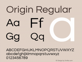
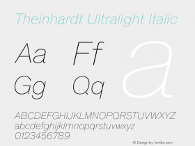
While Slanted #13 dealt with contemporary and historical humanist grotesque fonts, Slanted #14-Grotesque 2 focuses on current fonts that are in tradition of Lineal, Neo-or Geometric Grotesque.
They mainly have their origins in the time of the turn of 19th to 20th century.
In 1880 Ferdinand Theinhardt designed the Royal Grotesque with four weights for the Königlich-Preussische Akademie zu Berlin, from which developed the Akzidenz Grotesque in 1918.
Simultaneously, from 1905 to 1930, Morris Fuller Benton created fonts on the basis of Lineal Neo-grotesque: the Lineal Grotesque.
Nowadays there can be observed different procedures of designing fonts, which can be named as quotations. A variety of fonts bear on historical models.
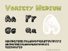
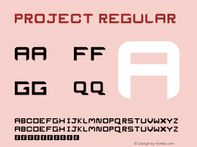
Slanted presents a huge number of these corresponding and related grotesque fonts, illustrations and projects. The type essays by Flo Gaertner (Karlsruhe), Robert Schumann (Berlin) and Anna Sinofzik (London) deal with them.



-
 ShanhaiFonts
Brand:山海字库
Area:China

-
 Cangji Fonts
Brand: 仓迹字库
Area: China
-
 JT Foundry
Brand: 翰字铸造
Area: Taiwan, China

-
 Handmadefont
Brand:
Area: Estonia

-
·千图字体
-
 HyFont Studio
Brand: 新美字库
Area: China


- ·Fonts Design of Childhood Memory
- ·New York New York, Jazz St. Louis
- ·Statement and Counter-Statement, Automatically Arranged Alphabets, and Arts/Rats/Star
- ·"Jesus Music" ad for Myrrh Records
- ·London Underground's iconic Johnston Sans typeface
- ·Food Not Bombs hypothetical redesign
- ·Chinese College Student Invents Smog Font
- ·Top 100 Fonts.com Web Fonts for May 2016
- ·Alphabet Stories by Hermann Zapf
- ·The Great Comic Book Heroes, by Jules Feiffer