



Fontke.com>Article>Details
海峡两岸字形上的差异性
Date:2005-01-23 18:08:29|
Chinese characters|Browse: 474|Source: http://blog.bs2.to/EdwardLee|Author: EdwardLee
Introduction一般的说法,两岸字体上的最大差异是:我们使用繁体,对岸使用简体。但,事情恐怕不是那么简单。除了繁简的使用上差异外,对岸对有些字体做了写法上的更动,他们也是有繁体字的,例如GBK/GB18030的编码与字集就收录了相当多的繁体字,但这些繁体字和我们使用的并不太
一般的说法,两岸字形上的最大差异是:我们使用繁体,对岸使用简体。但,事情恐怕不是那么简单。
除了繁简的使用上差异外,对岸对有些字形做了写法上的更动,他们也是有繁体字的,例如GBK/GB18030的编码与字集就收录了相当多的繁体字,但这些繁体字和我们使用的并不太一样。
最明显的,例如:“角”、“過”、“骨”,及所有含有这些部首的字,实际上的比较,请参考:
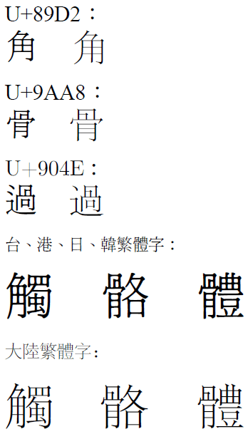
一般使用,大概有时会被忽略,但是在学校单位使用的话,可能会引起困扰。
Relevant font foundry

海峡两岸字形上的差异性 Comments
海峡两岸字形上的差异性 Latest comments
No relevant comments
-
 ShanhaiFonts
Brand:山海字库
Area:China

-
 Cangji Fonts
Brand: 仓迹字库
Area: China
-
 JT Foundry
Brand: 翰字铸造
Area: Taiwan, China

-
 Handmadefont
Brand:
Area: Estonia

-
·千图字体
-
 HyFont Studio
Brand: 新美字库
Area: China





Recommended font article
- ·Alphabet Stories by Hermann Zapf
- ·Type terms: the animated typographic cheat sheet
- ·"Jesus Music" ad for Myrrh Records
- ·He Invented a Font to Help People With Dyslexia Read
- ·10 Top Romantic Fonts on Valentine's Day!
- ·How House Industries Designs Its Retrotastic Logos and Typefaces
- ·Make market-ready fonts with this 8 point checklist
- ·Japanese Typography Writing System
- ·Fonts Design of Childhood Memory
- ·How to sell your typefaces