


Fontke.com>Article>Details
改善用户体验:亚马逊为Kindle增加了一款新字体
Date:2016-12-21 14:54:18|
News|Browse: 1016|Source: http://goodereader.com/blog/electronic-readers/amazon-releases-ember-bold-font-for-the-kindle|Author: 字客网编译
Introduction为帮助年长者及有视觉障碍的读者获得更流畅的阅读体验,亚马逊针对旗下的各款Kindle电子阅读器推出了全新的Ember Bold字体。新字体比标准字体更粗,因此更易阅读。此举旨在回应长久以来针对字体太细,不易阅读的抱怨,挽留用户。
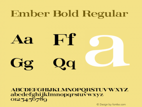
亚马逊于近日公布了一款新字体,叫做Ember Bold,该字体适用于Kindle Oasis, Kindle Paperwhite 以及 Kindle Voyage。这款新字体比Kindle电子阅读器使用的字体更粗,帮助年长者以及有视觉障碍的读者获得更流畅的阅读体验。
读者对于亚马逊推出的这一系列电子阅读器最主要的抱怨之一就是标准字体太细,很费眼睛。这就使得很多读者转而使用Kobo电子阅读器,因为后者提供多样的字体选择,而且允许读者导入自定义字体。其他人则选择在智能手机以及平板电脑上下载专门的应用。随着Ember Bold的公布,亚马逊终于解决了这项拖延已久的问题。
亚马逊将很快向Kindle电子阅读器的用户推送5.87版的固件升级。用户只需连接WIFI升级后,打开一本电子书,并在下拉菜单中选择新字体即可。

左边是Ember字体,右边是Ember Bold字体
Passage tag:
大公司,新字体,电子阅读器
Relevant font family
改善用户体验:亚马逊为Kindle增加了一款新字体 Comments
改善用户体验:亚马逊为Kindle增加了一款新字体 Latest comments
No relevant comments
-
 ShanhaiFonts
Brand:山海字库
Area:China

-
 Cangji Fonts
Brand: 仓迹字库
Area: China
-
 JT Foundry
Brand: 翰字铸造
Area: Taiwan, China

-
 Handmadefont
Brand:
Area: Estonia

-
·千图字体
-
 HyFont Studio
Brand: 新美字库
Area: China


Recommended font article
- ·The Future of Sex poster
- ·Iconic Transport for London logo undergoes subtle redesign
- ·"Fantastic!" ad for Captain Fantastic & the Brown Dirt Cowboy by Elton John & Bernie Taupin
- ·Moving Hands (Helena Hauff Remix) by The Klinik, official video
- ·Japanese Typography Writing System
- ·Chinese College Student Invents Smog Font
- ·Food Not Bombs hypothetical redesign
- ·London Underground's iconic Johnston Sans typeface
- ·Amazon Releases Ember Bold Font for the Kindle
- ·Top 100 Fonts.com Web Fonts for May 2016