



Fontke.com>Article>Details
Facebook测试采用新版字体Geneva 你能看出区别么?
Introduction据外媒Mashable报道,Facebook正在小范围内测试采用新字体Geneva,相较目前采用的Helvetica字体,新版本字
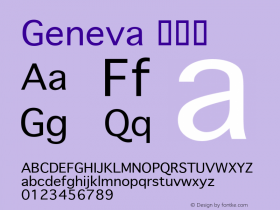
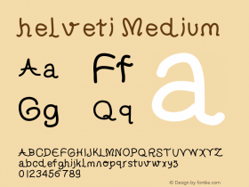
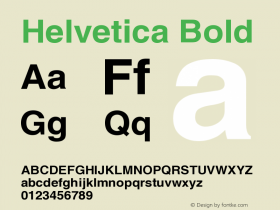
据外媒Mashable报道,Facebook正在小范围内测试采用新字体Geneva,相较目前采用的Helvetica字体,新版本字体更纤细更轻快,但是变化并不是十分显著,新字体组成的段落整体来看风格非常类似,Geneva更现代一些。
似乎只有图像设计专业的工作者,才能注意到新老版本字体细微的区别,对一般用户来说区别不大,最显著的区别为大写的G,和小写的a。目前来看,采用新版字体的Facebook还处于小规模测试阶段,而且仅对采用桌面设备浏览站点的部分用户开放。
老版本字体
新版本字体
Relevant font family
Facebook测试采用新版字体Geneva 你能看出区别么? Comments
Facebook测试采用新版字体Geneva 你能看出区别么? Latest comments
No relevant comments
-
 ShanhaiFonts
Brand:山海字库
Area:China

-
 Cangji Fonts
Brand: 仓迹字库
Area: China
-
 JT Foundry
Brand: 翰字铸造
Area: Taiwan, China

-
 Handmadefont
Brand:
Area: Estonia

-
·千图字体
-
 HyFont Studio
Brand: 新美字库
Area: China





Recommended font article
- ·The Form Book by Borries Schwesinger
- ·Ad for Vincebus Eruptum by Blue Cheer
- ·London Underground's iconic Johnston Sans typeface
- ·"Die Alpen – Vielfalt in Europa" stamp
- ·"Fantastic!" ad for Captain Fantastic & the Brown Dirt Cowboy by Elton John & Bernie Taupin
- ·Food Not Bombs hypothetical redesign
- ·Quimbaya Coffee Roasters
- ·Amazon Releases Ember Bold Font for the Kindle
- ·Sinnesreize / Embracing Sensation by Silvia Gertsch and Xerxes Ach
- ·Top 100 Fonts.com Web Fonts for May 2016