



It's About Legibility
Typographic clarity comes in two flavors: legibility and readability. Legibility is a function of typeface design. It's an informal measure of how easy it is to distinguish one letter from another in a particular typeface. Readability, on the other hand, is dependent upon how the typeface is used. Readability is about typography. It is a gauge of how easily words, phrases and blocks of copy can be read. It is therefore possible to take a very legible typeface and render it unreadable through poor typographic arrangement.
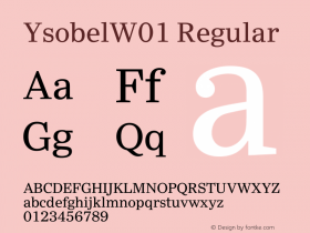
Generally, the most legible typefaces are those which offer big features and have restrained design characteristics. While these attributes may seem contradictory, actually they are not. "Big features" refers to things like large, open counters, ample lowercase x-heights, and character shapes that are obvious and easy to recognize. The most legible typefaces are also restrained, in that they are not excessively light or bold; their weight changes within characters are subtle; and if serifs are present, they are not overly elongated, very thin, nor extremely heavy. The Ysobel™, ITC Stone® Sans II, Egyptian Slate™, Malabar™ and Felbridge™ typefaces are great examples of legibility designs.

While not all typefaces should be designed to be paragons of legibility, those that are intended to be used for text or lengthy display composition should be the ones designers choose. Save the Eccentric™ and Frances Uncial™ of the world for three or four-word headlines.

Allan Haley is Director of Words & Letters at Monotype Imaging. Here he is responsible for strategic planning and creative implementation of just about everything related to typeface designs.




-
 ShanhaiFonts
Brand:山海字库
Area:China

-
 Cangji Fonts
Brand: 仓迹字库
Area: China
-
 JT Foundry
Brand: 翰字铸造
Area: Taiwan, China

-
 Handmadefont
Brand:
Area: Estonia

-
·千图字体
-
 HyFont Studio
Brand: 新美字库
Area: China


- ·Antropofagia. Palimpsesto Selvagem
- ·How to sell your typefaces
- ·Troubadour poster, Opera Plovdiv
- ·Bevésett nevek (Carved Names), vol. 2
- ·Ad for Hello Dummy! by Don Rickles
- ·Barbe à papa Cotton Candy
- ·Alibaba Supports Font Infringement Complaints
- ·Surabaya Beat by Beat Presser, Afterhours Books
- ·Ad for Vincebus Eruptum by Blue Cheer
- ·XUID Arrays: One Less Thing To Worry About