



Zetten en drukken in de achttiende eeuw


Photo: Studio Het Mes. License: All Rights Reserved.
"Typesetting and Printing in the Eighteenth Century" is the first edition of a never before published manuscript by typographer Bram de Does. The shaded caps used on the jacket and the title page were cut by Jacques-FrançoisRosartat Enschedé in 1759.

Photo: Studio Het Mes. License: All Rights Reserved.

Photo: Studio Het Mes. License: All Rights Reserved.

Photo: Studio Het Mes. License: All Rights Reserved.
The calligraphic lb ligature – an abbreviation for pound, in Latin: libra – doesn't quite match the text. This symbol is included in Unicode as ℔ (l b bar symbol).

Photo: Studio Het Mes. License: All Rights Reserved.

Photo: Studio Het Mes. License: All Rights Reserved.

Photo: Studio Het Mes. License: All Rights Reserved.

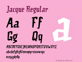
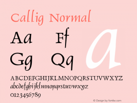
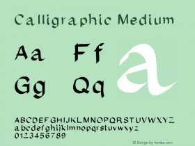
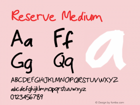

-
 ShanhaiFonts
Brand:山海字库
Area:China

-
 Cangji Fonts
Brand: 仓迹字库
Area: China
-
 JT Foundry
Brand: 翰字铸造
Area: Taiwan, China

-
 Handmadefont
Brand:
Area: Estonia

-
·千图字体
-
 HyFont Studio
Brand: 新美字库
Area: China





- ·Alphabet Stories by Hermann Zapf
- ·New York New York, Jazz St. Louis
- ·How to Read a Painting by Patrick de Rynck
- ·Japanese Typography Writing System
- ·20 Houses. A New Residential Landscape exhibition, Wallpaper* Architects Directory
- ·47 free tattoo fonts for your body art
- ·Linotype Ad: "Linotype vs. Intertype"
- ·Amazon Releases Ember Bold Font for the Kindle
- ·Once Upon DESIGN: New Routes for Arabian Heritage
- ·Cocoa Marsh Instant Fudge Candy Mix packaging