



David Lynch: Lithos


Source: http://komaamok.org.License: All Rights Reserved.
"The book David Lynch: Lithos is a kind of sequel to its predecessor Dark Splendor, which we designed half a year earlier. Where Dark Splendor is a colorful journey through the manifold media of his creative work, Lithos is a real monograph focusing on David Lynch's lithographs, mainly in black and white. Based on the type design we did for Dark Splendor and in combination with other type ideas we explored at that time we developed the font familyMateriafor the texts and the cover of Lithos. Instead of antique pink (as in Dark Splendor) this time the texts are printed on a soft blueish grey, reminding of the original color of the stones David Lynch uses for his lithographs." — Koma Amok

Source: http://komaamok.org.License: All Rights Reserved.

Source: http://www.hatjecantz.de.Image from Hatje Cantz. License: All Rights Reserved.
David Lynch: Dark Splendor, the book that preceded Lithos and the lettering that informed Materia. The rudimentary, square forms on this cover, however, have more in common with Optimo's Detroit and ACME'S AF Generation.

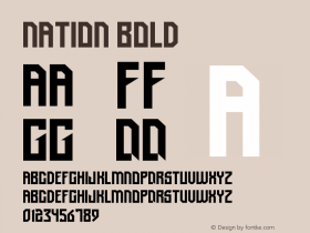

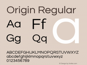

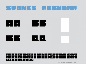

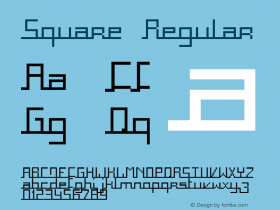

-
 ShanhaiFonts
Brand:山海字库
Area:China

-
 Cangji Fonts
Brand: 仓迹字库
Area: China
-
 JT Foundry
Brand: 翰字铸造
Area: Taiwan, China

-
 Handmadefont
Brand:
Area: Estonia

-
·千图字体
-
 HyFont Studio
Brand: 新美字库
Area: China





- ·Alibaba Supports Font Infringement Complaints
- ·The Great Comic Book Heroes, by Jules Feiffer
- ·MC5 – Back in the USA album cover
- ·Japanese Typography Writing System
- ·Top 100 Fonts.com Web Fonts for May 2016
- ·How to sell your typefaces
- ·47 free tattoo fonts for your body art
- ·Moving Hands (Helena Hauff Remix) by The Klinik, official video
- ·Surabaya Beat by Beat Presser, Afterhours Books
- ·Quimbaya Coffee Roasters