



Enso Magazine homepage


Source: https://twitter.com.License: All Rights Reserved.
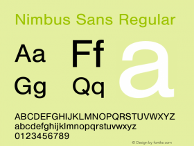
Readymag. The logo is set inNimbus Sans, URW's version of Helvetica which departs from its source most visibily in the extreme weights, or in the Bold Extended where Nimbus has nearly circular (rather than squared) counters in its stick-and-ball shapes ('bgpq'). Nimbus Sans' feeling overall is slightly off-kilter, almost like poster woodtype, and that gives it a vintage mid-century quality. Willy Fleckhaus'Plain, another Neo-Grotesk, this one by François Rappo for Optimo, which might have better spacing and openness for small sizes.
Specific issues of Enso will be covered in other entries here on Fonts In Use.
Source: http://enso.readymag.com.License: All Rights Reserved.
Source: http://enso.readymag.com.License: All Rights Reserved.

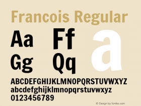
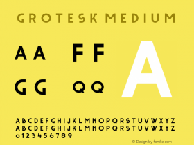

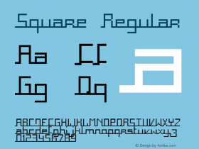


-
 ShanhaiFonts
Brand:山海字库
Area:China

-
 Cangji Fonts
Brand: 仓迹字库
Area: China
-
 JT Foundry
Brand: 翰字铸造
Area: Taiwan, China

-
 Handmadefont
Brand:
Area: Estonia

-
·千图字体
-
 HyFont Studio
Brand: 新美字库
Area: China





- ·Why Apple Abandoned the World's Most Beloved Typeface?
- ·How to Read a Painting by Patrick de Rynck
- ·Amazon Releases Ember Bold Font for the Kindle
- ·Type terms: the animated typographic cheat sheet
- ·Make market-ready fonts with this 8 point checklist
- ·The Future of Sex poster
- ·Quimbaya Coffee Roasters
- ·Linotype Ad: "Linotype vs. Intertype"
- ·How to sell your typefaces
- ·20 Houses. A New Residential Landscape exhibition, Wallpaper* Architects Directory