



Hope & Anchor branding


Source: http://rosielees.co.uk.Photo: Mark Fleming. License: All Rights Reserved. Artwork by Mark Fleming.
Hope + Anchor, an award-winning strategic insight agency, approached Rosie Lee needing a brand identity to help cement them within their sector yet set them apart from their competitors.
The Hope + Anchor name was inspired by the key strengths and approach of the agency; namely, its use of creative thinking and people (Hope) combined with its grounded understanding of clients' business needs (Anchor).
We developed a brand identity that emphasised this duality and that used an invisible horizon line to visualise the contrast between the two words – Hope as rising and Anchor as weighted. This concept runs throughout the identity with all key typographic statements appearing to float.
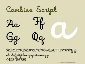
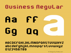
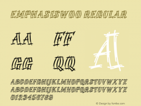
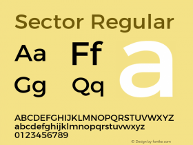


-
 ShanhaiFonts
Brand:山海字库
Area:China

-
 Cangji Fonts
Brand: 仓迹字库
Area: China
-
 JT Foundry
Brand: 翰字铸造
Area: Taiwan, China

-
 Handmadefont
Brand:
Area: Estonia

-
·千图字体
-
 HyFont Studio
Brand: 新美字库
Area: China





- ·Why Apple Abandoned the World's Most Beloved Typeface?
- ·Cher Got Sued For Font!
- ·London Underground's iconic Johnston Sans typeface
- ·How to Read a Painting by Patrick de Rynck
- ·How House Industries Designs Its Retrotastic Logos and Typefaces
- ·Ad for Hello Dummy! by Don Rickles
- ·47 free tattoo fonts for your body art
- ·Food Not Bombs hypothetical redesign
- ·Type terms: the animated typographic cheat sheet
- ·Jim Nutt: Coming Into Character at Museum of Contemporary Art Chicago