


Der Mensch und seine Zeichen by Adrian Frutiger


Photo: Florian Hardwig. License: All Rights Reserved.
In memoriam Adrian Frutiger, 1928–2015.
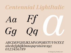
"Man and his signs" is a series of books written and illustrated by Adrian Frutiger. The content is based on the teaching materials as used in his classes atIridium, Frutiger's first typeface design for Stempel. It was made in 1972 for phototypesetting technology, following the request to "design the most beautiful typeface you're capable of."² Iridium later was replaced by Linotype Centennial when the original three volumes were merged into one book.³
Text editing: Horst Heiderhoff (art director at Stempel)
Final artwork vol. 1: Helena Novak
Typesetting and printing: Hausdruckerei der D. Stempel AG
1–3: Osterer & Stamm (ed.): Adrian Frutiger – Typefaces: The Complete Works

Photo: Florian Hardwig. License: All Rights Reserved.

Photo: Florian Hardwig. License: All Rights Reserved.
Sample spread from the interior (vol. 2, chapter VII "The manipulated letterform")


-
 ShanhaiFonts
Brand:山海字库
Area:China

-
 Cangji Fonts
Brand: 仓迹字库
Area: China
-
 JT Foundry
Brand: 翰字铸造
Area: Taiwan, China

-
 Handmadefont
Brand:
Area: Estonia

-
·千图字体
-
 HyFont Studio
Brand: 新美字库
Area: China


- ·Benetton identity redesign
- ·20 Houses. A New Residential Landscape exhibition, Wallpaper* Architects Directory
- ·Barbe à papa Cotton Candy
- ·Statement and Counter-Statement, Automatically Arranged Alphabets, and Arts/Rats/Star
- ·Cher Got Sued For Font!
- ·Food Not Bombs hypothetical redesign
- ·Cocoa Marsh Instant Fudge Candy Mix packaging
- ·Japanese Typography Writing System
- ·MC5 – Back in the USA album cover
- ·How to Read a Painting by Patrick de Rynck