


Fontke.com>Article>Details
Branding for Saastamoisen saatio
IntroductionThis art collection from Finland with an unpronounceable name jus
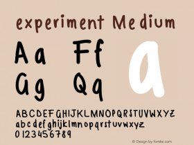
This art collection from Finland with an unpronounceable name just got its corporate identity after existing for almost 50 years. With more than 2'500 pieces, it's one of the largest collections of Finland. The identity is purely typographic and kind of experimental, with an interesting display of letters arranged in a grid. Designed by Tony Erapuro and Kuudes Kerros.
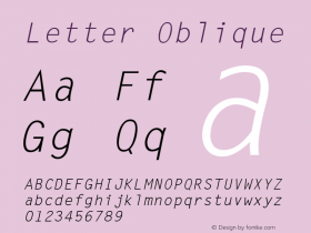
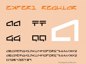
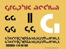
Relevant font family


Branding for Saastamoisen saatio Comments
Branding for Saastamoisen saatio Latest comments
No relevant comments
-
 ShanhaiFonts
Brand:山海字库
Area:China

-
 Cangji Fonts
Brand: 仓迹字库
Area: China
-
 JT Foundry
Brand: 翰字铸造
Area: Taiwan, China

-
 Handmadefont
Brand:
Area: Estonia

-
·千图字体
-
 HyFont Studio
Brand: 新美字库
Area: China


Recommended font article
- ·Moving Hands (Helena Hauff Remix) by The Klinik, official video
- ·XUID Arrays: One Less Thing To Worry About
- ·47 free tattoo fonts for your body art
- ·Hollywood Star Matt Damon Wrote Better Chinese than Chinese Stars
- ·Quimbaya Coffee Roasters
- ·How House Industries Designs Its Retrotastic Logos and Typefaces
- ·10 Top Romantic Fonts on Valentine's Day!
- ·"Fantastic!" ad for Captain Fantastic & the Brown Dirt Cowboy by Elton John & Bernie Taupin
- ·Antropofagia. Palimpsesto Selvagem
- ·Fonts Design of Childhood Memory