



Fontke.com>Article>Details
Coronation Street main title card (1970s)
IntroductionSource: http://www.5percangol.hu.License: All Rights Reserved.Unl


Source: http://www.5percangol.hu.License: All Rights Reserved.
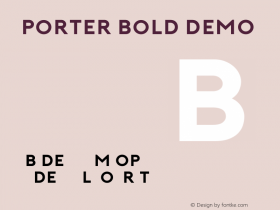
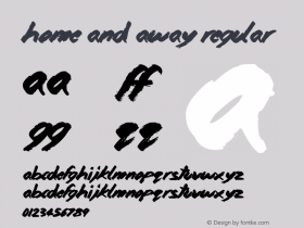
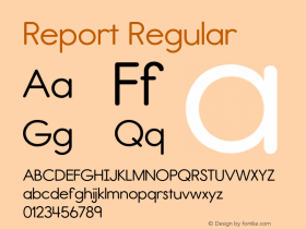
Unlike Home and Away, which has never severed its relationship with the Reporter face, Corrie's title cards have gone through a handful of faces over its still-solid run. As evidenced by a combo of the text shadow and clear non-grainy appearance of the title sequence, this card dates at least to the mid-1970s.
Relevant font family



Coronation Street main title card (1970s) Comments
Coronation Street main title card (1970s) Latest comments
No relevant comments
-
 ShanhaiFonts
Brand:山海字库
Area:China

-
 Cangji Fonts
Brand: 仓迹字库
Area: China
-
 JT Foundry
Brand: 翰字铸造
Area: Taiwan, China

-
 Handmadefont
Brand:
Area: Estonia

-
·千图字体
-
 HyFont Studio
Brand: 新美字库
Area: China





Recommended font article
- ·Benetton identity redesign
- ·Statement and Counter-Statement, Automatically Arranged Alphabets, and Arts/Rats/Star
- ·Antropofagia. Palimpsesto Selvagem
- ·Japanese Typography Writing System
- ·Type terms: the animated typographic cheat sheet
- ·Troubadour poster, Opera Plovdiv
- ·"David Bowie is turning us all into voyeurs" button
- ·Cocoa Marsh Instant Fudge Candy Mix packaging
- ·Alibaba Supports Font Infringement Complaints
- ·"Die Alpen – Vielfalt in Europa" stamp