



Brot für die Welt (2011–)


Photo: Florian Hardwig. License: CC BY-NC-SA.
Billboard ad "There is enough for everyone."
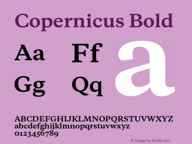
Galaxy Copernicusas the main typeface.
The iconic logo in Antique Olive had to make way for something less distinctive. The new logo doesn't use a font. It retains a few traits like the orange squircle 'o' and the 't' with the bracketed top left and the curved tail. In combination with the other generic Grotesk letters, the result feels like a botch job, though — it's neither fish nor fowl.

Source: http://www.factordesign.com.License: All Rights Reserved.
Annual report 2011

Source: http://www.factordesign.com.License: All Rights Reserved.
Various leaflets

Source: http://www.factordesign.com.License: All Rights Reserved.

Source: http://www.brot-fuer-die-welt.de.License: All Rights Reserved.
First page of Aktuell #52 (7/2015). Layout: János Theil

Source: http://www.brot-fuer-die-welt.de.License: All Rights Reserved.
Cover of Analyse #48 (2/2015). Layout: János Theil.

Source: https://www.brot-fuer-die-welt.de.License: All Rights Reserved.
Ad "Weniger ist leer" (Less is empty)



-
 ShanhaiFonts
Brand:山海字库
Area:China

-
 Cangji Fonts
Brand: 仓迹字库
Area: China
-
 JT Foundry
Brand: 翰字铸造
Area: Taiwan, China

-
 Handmadefont
Brand:
Area: Estonia

-
·千图字体
-
 HyFont Studio
Brand: 新美字库
Area: China





- ·Iconic Transport for London logo undergoes subtle redesign
- ·10 Top Romantic Fonts on Valentine's Day!
- ·Alibaba Supports Font Infringement Complaints
- ·Hollywood Star Matt Damon Wrote Better Chinese than Chinese Stars
- ·Königsblut identity
- ·Bevésett nevek (Carved Names), vol. 2
- ·20 Houses. A New Residential Landscape exhibition, Wallpaper* Architects Directory
- ·Japanese Typography Writing System
- ·How House Industries Designs Its Retrotastic Logos and Typefaces
- ·He Invented a Font to Help People With Dyslexia Read