


Eileen Fisher logo


Source: https://www.facebook.com.License: All Rights Reserved.
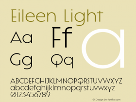
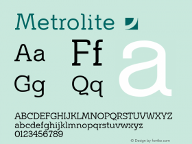
The mark for women's clothing label Eileen Fisher is set in a slighly condensed MetroLite fromMetro No. 2, which is very representative of the brand's design: understated, spare, light, modern with a touch of humanism. I do question the spacing, however: someone felt the need to vertically align the 'L' with the 'S', yet the 'E' not quite with the 'H', ignoring the large space created between 'L' and 'E' in the first line. Once you read "EIL EEN", you cannot unread it.

Source: http://www.eileenfisher.com.License: All Rights Reserved.

Source: http://www.sergiokurhajec.com.License: All Rights Reserved.

Source: http://www.sergiokurhajec.com.License: All Rights Reserved.

Source: http://www.manrepeller.com.License: All Rights Reserved.


-
 ShanhaiFonts
Brand:山海字库
Area:China

-
 Cangji Fonts
Brand: 仓迹字库
Area: China
-
 JT Foundry
Brand: 翰字铸造
Area: Taiwan, China

-
 Handmadefont
Brand:
Area: Estonia

-
·千图字体
-
 HyFont Studio
Brand: 新美字库
Area: China


- ·Troubadour poster, Opera Plovdiv
- ·Königsblut identity
- ·Alphabet Stories by Hermann Zapf
- ·Japanese Typography Writing System
- ·London Underground's iconic Johnston Sans typeface
- ·Ad for Vincebus Eruptum by Blue Cheer
- ·Type terms: the animated typographic cheat sheet
- ·Ad for Hello Dummy! by Don Rickles
- ·XUID Arrays: One Less Thing To Worry About
- ·Hollywood Star Matt Damon Wrote Better Chinese than Chinese Stars