


Eileen Fisher logo


Source: https://www.facebook.com.License: All Rights Reserved.
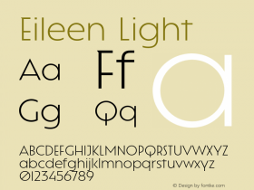
The mark for women's clothing label Eileen Fisher is set in a slighly condensed MetroLite fromMetro No. 2, which is very representative of the brand's design: understated, spare, light, modern with a touch of humanism. I do question the spacing, however: someone felt the need to vertically align the 'L' with the 'S', yet the 'E' not quite with the 'H', ignoring the large space created between 'L' and 'E' in the first line. Once you read "EIL EEN", you cannot unread it.

Source: http://www.eileenfisher.com.License: All Rights Reserved.

Source: http://www.sergiokurhajec.com.License: All Rights Reserved.

Source: http://www.sergiokurhajec.com.License: All Rights Reserved.

Source: http://www.manrepeller.com.License: All Rights Reserved.


-
 ShanhaiFonts
Brand:山海字库
Area:China

-
 Cangji Fonts
Brand: 仓迹字库
Area: China
-
 JT Foundry
Brand: 翰字铸造
Area: Taiwan, China

-
 Handmadefont
Brand:
Area: Estonia

-
·千图字体
-
 HyFont Studio
Brand: 新美字库
Area: China


- ·Linotype Ad: "Linotype vs. Intertype"
- ·How House Industries Designs Its Retrotastic Logos and Typefaces
- ·10 Top Romantic Fonts on Valentine's Day!
- ·Königsblut identity
- ·Benetton identity redesign
- ·Japanese Typography Writing System
- ·"Jesus Music" ad for Myrrh Records
- ·XUID Arrays: One Less Thing To Worry About
- ·47 free tattoo fonts for your body art
- ·Moving Hands (Helena Hauff Remix) by The Klinik, official video