



Fontke.com>Article>Details
INVSBLE's identity is so minimalist that they took some letters out
IntroductionIn the choice of its name and spelling, INVSBLE boutique already
In the choice of its name and spelling, INVSBLE boutique already opted for a minimalist approach. The visual identity that follows is just as minimalist and workd extremely well. It works even better on the small brochure, thanks to the printing on transparent paper.
This identity was designed by Montreal-based designers Emmanuel Cohen and Justin Lortie, who published it on Behance.
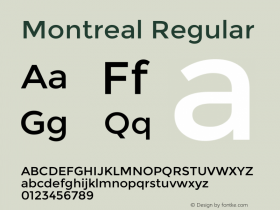
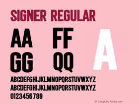
Relevant font family



INVSBLE's identity is so minimalist that they took some letters out Comments
INVSBLE's identity is so minimalist that they took some letters out Latest comments
No relevant comments
-
 ShanhaiFonts
Brand:山海字库
Area:China

-
 Cangji Fonts
Brand: 仓迹字库
Area: China
-
 JT Foundry
Brand: 翰字铸造
Area: Taiwan, China

-
 Handmadefont
Brand:
Area: Estonia

-
·千图字体
-
 HyFont Studio
Brand: 新美字库
Area: China





Recommended font article
- ·How House Industries Designs Its Retrotastic Logos and Typefaces
- ·The Future of Sex poster
- ·Japanese Typography Writing System
- ·Statement and Counter-Statement, Automatically Arranged Alphabets, and Arts/Rats/Star
- ·Barbe à papa Cotton Candy
- ·Ad for Vincebus Eruptum by Blue Cheer
- ·Alphabet Stories by Hermann Zapf
- ·Once Upon DESIGN: New Routes for Arabian Heritage
- ·47 free tattoo fonts for your body art
- ·"David Bowie is turning us all into voyeurs" button