



Art Basel Campaign 2014


Source: http://www.demianconrad.com.Demian Conrad Studio. License: All Rights Reserved.
Demian Conrad writes:
The 2014 Art Basel campaign combines fluo and metal colors. This color choice is unexpected and generates a great impact on the public, because of the connection of different semantic areas: indeed the fluo colors reflect the artificial and synthetic, whereas the metal colors are related with the natural and the substance.

Source: http://www.demianconrad.com.Demian Conrad Studio. License: All Rights Reserved.

Source: http://www.demianconrad.com.Demian Conrad Studio. License: All Rights Reserved.

Source: http://www.demianconrad.com.Demian Conrad Studio. License: All Rights Reserved.

Source: http://www.demianconrad.com.Demian Conrad Studio. License: All Rights Reserved.

Source: http://www.demianconrad.com.Demian Conrad Studio. License: All Rights Reserved.
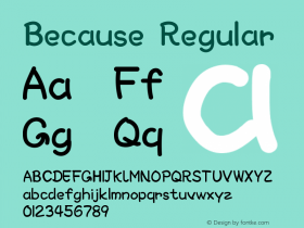
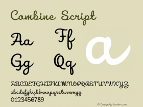

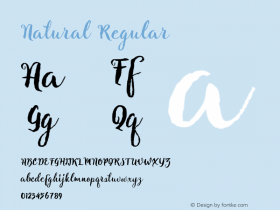
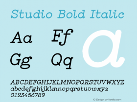



-
 ShanhaiFonts
Brand:山海字库
Area:China

-
 Cangji Fonts
Brand: 仓迹字库
Area: China
-
 JT Foundry
Brand: 翰字铸造
Area: Taiwan, China

-
 Handmadefont
Brand:
Area: Estonia

-
·千图字体
-
 HyFont Studio
Brand: 新美字库
Area: China





- ·Barbe à papa Cotton Candy
- ·Antropofagia. Palimpsesto Selvagem
- ·How to sell your typefaces
- ·Sinnesreize / Embracing Sensation by Silvia Gertsch and Xerxes Ach
- ·Alphabet Stories by Hermann Zapf
- ·How to Read a Painting by Patrick de Rynck
- ·Bevésett nevek (Carved Names), vol. 2
- ·How House Industries Designs Its Retrotastic Logos and Typefaces
- ·The Form Book by Borries Schwesinger
- ·Top 100 Fonts.com Web Fonts for May 2016