



Aamodt / Plumb


License: All Rights Reserved.
The visual identity usesFounders Groteskby Klim Type Foundry.
TwoPoints.Net was commissioned by the architecture studio Aamodt/Plumb to design their new visual identity. TwoPoints decided to retain the slash between their names, turning it into a flexible visual system. The slash was turned into a line, the line into a division of space, the space into a placeholder for the studio's work. Aamodt/Plumb sensitive use of materials play an important role in their work, as does a thoughtful attention to the design both internally and externally. These concepts played an important role in the creation of the visual identity. Additional corporate colours helped to define an unique brand.

Source: http://www.twopoints.net.Photo: Martin Lorenz. License: All Rights Reserved. Artwork by Martin Lorenz.

License: All Rights Reserved.

License: All Rights Reserved.

License: All Rights Reserved.

License: All Rights Reserved.

License: All Rights Reserved.

License: All Rights Reserved.

License: All Rights Reserved.

License: All Rights Reserved.

License: All Rights Reserved.

License: All Rights Reserved.

License: All Rights Reserved.
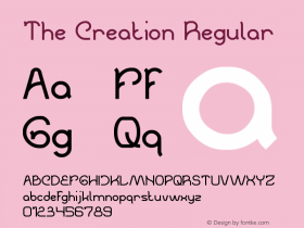

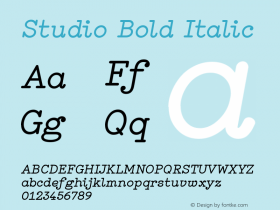

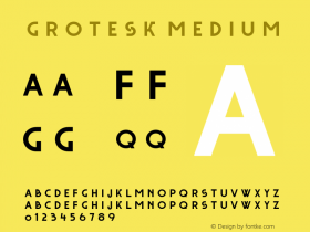



-
 ShanhaiFonts
Brand:山海字库
Area:China

-
 Cangji Fonts
Brand: 仓迹字库
Area: China
-
 JT Foundry
Brand: 翰字铸造
Area: Taiwan, China

-
 Handmadefont
Brand:
Area: Estonia

-
·千图字体
-
 HyFont Studio
Brand: 新美字库
Area: China


- ·Once Upon DESIGN: New Routes for Arabian Heritage
- ·Chinese College Student Invents Smog Font
- ·Top 100 Fonts.com Web Fonts for May 2016
- ·10 Top Romantic Fonts on Valentine's Day!
- ·The Future of Sex poster
- ·Cher Got Sued For Font!
- ·Japanese Typography Writing System
- ·Sinnesreize / Embracing Sensation by Silvia Gertsch and Xerxes Ach
- ·"Fantastic!" ad for Captain Fantastic & the Brown Dirt Cowboy by Elton John & Bernie Taupin
- ·Königsblut identity