


Dokk


Source: http://dokk.no.License: All Rights Reserved.
Dokkis a new magazine, online-only, for long-form journalism — focus topics are culture, sports and politics. That's a broad net: articles range from criminal investigations to news room redesigns, and from nazism to League of Legends players.
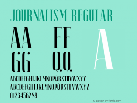
The design process started with good article typography.Farnham Text, by Christian Schwartz, does heavy duty work for the article body, whileFarnham Displayis used for the lead titles. Secondary typography uses Mark van Bronkhorst's understatedSolitaire. Together they shape a gentle article view.
Interface elements, such as the menu, forms, buttons and miscellaneous calls to action, use Solitaire to its strengths, in only two weights. The logo is a custom drawing based on the commonalities between the two fonts. It's a strong-shouldered, classically-proportioned sans-serif with generous contrast.
Dokk hopes to introduce a new platform for good journalism in Norway. The digital-only focus allows them to cut a lot of overhead, while spreading the articles as broadly as possible.

Source: http://dokk.no.License: All Rights Reserved.

Source: http://dokk.no.License: All Rights Reserved.


-
 ShanhaiFonts
Brand:山海字库
Area:China

-
 Cangji Fonts
Brand: 仓迹字库
Area: China
-
 JT Foundry
Brand: 翰字铸造
Area: Taiwan, China

-
 Handmadefont
Brand:
Area: Estonia

-
·千图字体
-
 HyFont Studio
Brand: 新美字库
Area: China


- ·Amazon Releases Ember Bold Font for the Kindle
- ·"Die Alpen – Vielfalt in Europa" stamp
- ·New York New York, Jazz St. Louis
- ·Königsblut identity
- ·Type terms: the animated typographic cheat sheet
- ·Top 100 Fonts.com Web Fonts for May 2016
- ·Antropofagia. Palimpsesto Selvagem
- ·"Fantastic!" ad for Captain Fantastic & the Brown Dirt Cowboy by Elton John & Bernie Taupin
- ·47 free tattoo fonts for your body art
- ·Linotype Ad: "Linotype vs. Intertype"