



Fontke.com>Article>Details
In These Changing Times / Right Before My Eyes by Four Tops
IntroductionSource: http://images.45cat.com.EMI Music Germany/Motown. License


Source: http://images.45cat.com.EMI Music Germany/Motown. License: All Rights Reserved.
This sleeve was designed for the German release of In These Changing Timesby Four Tops. The multiline typeface used for the group's name is Milton Glaser and Seymour Chwast'sFilmsense.Futurais used for the title.
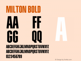
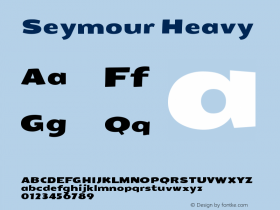
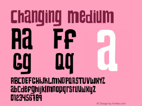
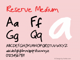
Relevant font family




Relevant font designer

In These Changing Times / Right Before My Eyes by Four Tops Comments
In These Changing Times / Right Before My Eyes by Four Tops Latest comments
No relevant comments
-
 ShanhaiFonts
Brand:山海字库
Area:China

-
 Cangji Fonts
Brand: 仓迹字库
Area: China
-
 JT Foundry
Brand: 翰字铸造
Area: Taiwan, China

-
 Handmadefont
Brand:
Area: Estonia

-
·千图字体
-
 HyFont Studio
Brand: 新美字库
Area: China


Recommended font article
- ·The Form Book by Borries Schwesinger
- ·Top 100 Fonts.com Web Fonts for May 2016
- ·20 Houses. A New Residential Landscape exhibition, Wallpaper* Architects Directory
- ·Jim Nutt: Coming Into Character at Museum of Contemporary Art Chicago
- ·MC5 – Back in the USA album cover
- ·The Great Comic Book Heroes, by Jules Feiffer
- ·Sinnesreize / Embracing Sensation by Silvia Gertsch and Xerxes Ach
- ·Brother Moto Flat-Trackin' Tee
- ·Once Upon DESIGN: New Routes for Arabian Heritage
- ·How to Read a Painting by Patrick de Rynck