


Lux Optik


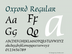
Source: https://www.flickr.com.Photo: Florian Hardwig. License: All Rights Reserved.
Store front of an optician on Karl-Marx-Straße, Berlin-Neukölln. The typeface in use was "designed in 1969 when Christine [Lord] was 21 as a special project to create a corporate identity for the new Oxford Polytechnic. The face was originally called Lord Lower Case Linked, but was later renamedOxfordwhen picked up by Face Photosetting. It was then made available as dry transfer lettering by Letraset." — tell 'u' from 'n' and typically appears in traditional German handwriting and script typefaces. Here, it is dispensable.
The photo was taken in 2011. The sign has soon after been replaced by something less interesting.


-
 ShanhaiFonts
Brand:山海字库
Area:China

-
 Cangji Fonts
Brand: 仓迹字库
Area: China
-
 JT Foundry
Brand: 翰字铸造
Area: Taiwan, China

-
 Handmadefont
Brand:
Area: Estonia

-
·千图字体
-
 HyFont Studio
Brand: 新美字库
Area: China


- ·Ad for Hello Dummy! by Don Rickles
- ·"Jesus Music" ad for Myrrh Records
- ·Food Not Bombs hypothetical redesign
- ·How House Industries Designs Its Retrotastic Logos and Typefaces
- ·"Fantastic!" ad for Captain Fantastic & the Brown Dirt Cowboy by Elton John & Bernie Taupin
- ·London Underground's iconic Johnston Sans typeface
- ·Alphabet Stories by Hermann Zapf
- ·Ad for Vincebus Eruptum by Blue Cheer
- ·Sinnesreize / Embracing Sensation by Silvia Gertsch and Xerxes Ach
- ·Statement and Counter-Statement, Automatically Arranged Alphabets, and Arts/Rats/Star