


Fontke.com>Article>Details
Entrance by Edgar Winter
IntroductionLicense: All Rights Reserved.Richard Mantel's design for Edgar Wi


License: All Rights Reserved.
Richard Mantel's design for Edgar Winter's debut album emphasized his snowy whiteness. Some versions go even further, with the album title (Entrance) in white rather than black. The type is spaced so tight it's overlapping, and Mantel wisely dropped the dot on the 'i' to avoid trouble with the 'W'.

Source: https://www.flickr.com.Image via Dereck Higgins. License: All Rights Reserved.

License: All Rights Reserved.
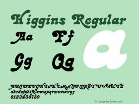
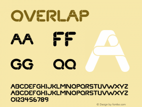
Relevant font family


Entrance by Edgar Winter Comments
Entrance by Edgar Winter Latest comments
No relevant comments
-
 ShanhaiFonts
Brand:山海字库
Area:China

-
 Cangji Fonts
Brand: 仓迹字库
Area: China
-
 JT Foundry
Brand: 翰字铸造
Area: Taiwan, China

-
 Handmadefont
Brand:
Area: Estonia

-
·千图字体
-
 HyFont Studio
Brand: 新美字库
Area: China


Recommended font article
- ·The Form Book by Borries Schwesinger
- ·How to sell your typefaces
- ·Food Not Bombs hypothetical redesign
- ·The Great Comic Book Heroes, by Jules Feiffer
- ·Chinese College Student Invents Smog Font
- ·Benetton identity redesign
- ·10 Top Romantic Fonts on Valentine's Day!
- ·"Die Alpen – Vielfalt in Europa" stamp
- ·Brother Moto Flat-Trackin' Tee
- ·Ad for Vincebus Eruptum by Blue Cheer