


GB 18030 Oddity or Design Flaw? (Redux)
As I described in an article earlier this year, GB 18030 artificially imposes a visual difference between Radicals #74 (⽉) and #130 (⾁) for character pairs that differ only in this component, though conventions for Simplified Chinese use a unified form that looks like Radical #74. In that article I pinpointed a case for which the character that uses Radical #130 is in error, because its left-side radical uses the Radical #74 form, and the corresponding character that uses Radical #74 is outside the scope of GB 18030 (at least for now).
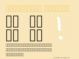
Thanks to Jaemin Chung, I was able to find three errors within the scope of GB 18030, as shown below:

According to the principles imposed by GB 18030, the characters on the left are in error, and should be visually distinct from those on the right in terms of their left-side radical.
So, how do I feel about this? Guess.
☺


-
 ShanhaiFonts
Brand:山海字库
Area:China

-
 Cangji Fonts
Brand: 仓迹字库
Area: China
-
 JT Foundry
Brand: 翰字铸造
Area: Taiwan, China

-
 Handmadefont
Brand:
Area: Estonia

-
·千图字体
-
 HyFont Studio
Brand: 新美字库
Area: China


- ·MC5 – Back in the USA album cover
- ·He Invented a Font to Help People With Dyslexia Read
- ·Food Not Bombs hypothetical redesign
- ·Once Upon DESIGN: New Routes for Arabian Heritage
- ·Sinnesreize / Embracing Sensation by Silvia Gertsch and Xerxes Ach
- ·Why Apple Abandoned the World's Most Beloved Typeface?
- ·The Great Comic Book Heroes, by Jules Feiffer
- ·20 Houses. A New Residential Landscape exhibition, Wallpaper* Architects Directory
- ·Jim Nutt: Coming Into Character at Museum of Contemporary Art Chicago
- ·Cocoa Marsh Instant Fudge Candy Mix packaging