


The Big Green Tent by Ludmila Ulitskaya


Source: http://www.casualoptimist.com.License: All Rights Reserved.
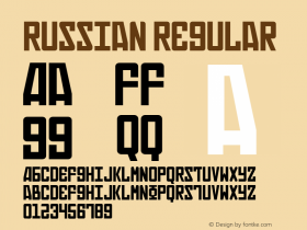
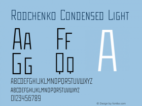
As soon as the topic is somehow related to the Soviet Union or communism, many Western designers show a knee-jerk reaction and reach for blocky angular caps, as they often were used on avant-garde posters from the era of the Russian Revolution and the interbellum. Ludmila Ulitskaya's novel is not set in the 1920s, but some 30 years later. By then, Stenberg or Rodchenko. All letterforms are made from straight lines only. Interestingly, a few corners have been rounded in this use. Tagir Safayev designed the initial weight of Rodchenko in 1996. In 1997, it was licensed to ITC and published as Stenberg, including an Inline style. The less tightly spaced Rodchenko (ParaType, 1996–2002) adds two lighter weights as well as condensed styles. Both fonts are named after outstanding Constructivist designers: the Stenberg brothers and Aleksander Rodchenko.
via Casual Optimist's Book Covers of Note November 2014

Source: http://devinwashburn.com.(background cropped) Devin Washburn. License: All Rights Reserved.


-
 ShanhaiFonts
Brand:山海字库
Area:China

-
 Cangji Fonts
Brand: 仓迹字库
Area: China
-
 JT Foundry
Brand: 翰字铸造
Area: Taiwan, China

-
 Handmadefont
Brand:
Area: Estonia

-
·千图字体
-
 HyFont Studio
Brand: 新美字库
Area: China


- ·Chinese College Student Invents Smog Font
- ·Cher Got Sued For Font!
- ·Brother Moto Flat-Trackin' Tee
- ·Alibaba Supports Font Infringement Complaints
- ·Linotype Ad: "Linotype vs. Intertype"
- ·Fonts Design of Childhood Memory
- ·Make market-ready fonts with this 8 point checklist
- ·How House Industries Designs Its Retrotastic Logos and Typefaces
- ·Quimbaya Coffee Roasters
- ·Troubadour poster, Opera Plovdiv