



Fontke.com>Article>Details
The Post Office Magazine (Vol. 1, issue 1, Jan 1934)
IntroductionSource: https://www.flickr.com.Uploaded to Flickr by Mikey and ta


Source: https://www.flickr.com.Uploaded to Flickr by Mikey and tagged with "gillsansshadowline". License: All Rights Reserved.
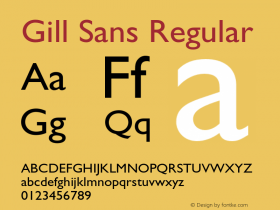
The cover of the first edition of the UK's Post Office Magazine – showing a postman at work emptying a Type C letter box. I'm surprised the GPO hadn't had a staff magazine before this – given that as the editorial itself states there were 'a quarter of a million' PO employees at this date. The very 'clean' looking cover uses the relatively modern (at the time)Gill Sans Shadow Linetypeface.
Relevant font family


The Post Office Magazine (Vol. 1, issue 1, Jan 1934) Comments
The Post Office Magazine (Vol. 1, issue 1, Jan 1934) Latest comments
No relevant comments
-
 ShanhaiFonts
Brand:山海字库
Area:China

-
 Cangji Fonts
Brand: 仓迹字库
Area: China
-
 JT Foundry
Brand: 翰字铸造
Area: Taiwan, China

-
 Handmadefont
Brand:
Area: Estonia

-
·千图字体
-
 HyFont Studio
Brand: 新美字库
Area: China





Recommended font article
- ·How House Industries Designs Its Retrotastic Logos and Typefaces
- ·Brother Moto Flat-Trackin' Tee
- ·Once Upon DESIGN: New Routes for Arabian Heritage
- ·Japanese Typography Writing System
- ·Statement and Counter-Statement, Automatically Arranged Alphabets, and Arts/Rats/Star
- ·"Jesus Music" ad for Myrrh Records
- ·Alphabet Stories by Hermann Zapf
- ·Cher Got Sued For Font!
- ·London Underground's iconic Johnston Sans typeface
- ·Why Apple Abandoned the World's Most Beloved Typeface?