


Equilibrists Thomas & Ruhller


Source: http://www.briefcasetype.com.License: All Rights Reserved.
Thomas & Ruhller – yin & yang, two sad clowns from the land of the tulip, jugglers of taste and artists of the future, where the difference between high and low doesn't exist. Aleš Najbrt designed many posters, invitations, calendars and programmes for these fine equilibrists.
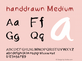
The template for theThomas & Ruhllertypeface was designed in 1989 and was originally handdrawn with ink on paper. The typeface was primarily created for use in advertising, promoting and marketing the two performers' tours and shows. The first digitization covered only a basic character set. The new digitization for Briefcase features additional and alternative glyphs.

Source: http://www.briefcasetype.com.http://www.mojemoje.com/cs/. License: All Rights Reserved.

Source: http://www.briefcasetype.com.License: All Rights Reserved.

Source: http://www.briefcasetype.com.License: All Rights Reserved.

Source: http://www.briefcasetype.com.License: All Rights Reserved.

Source: http://www.briefcasetype.com.License: All Rights Reserved.


-
 ShanhaiFonts
Brand:山海字库
Area:China

-
 Cangji Fonts
Brand: 仓迹字库
Area: China
-
 JT Foundry
Brand: 翰字铸造
Area: Taiwan, China

-
 Handmadefont
Brand:
Area: Estonia

-
·千图字体
-
 HyFont Studio
Brand: 新美字库
Area: China


- ·How House Industries Designs Its Retrotastic Logos and Typefaces
- ·Japanese Typography Writing System
- ·The Form Book by Borries Schwesinger
- ·"Jesus Music" ad for Myrrh Records
- ·Iconic Transport for London logo undergoes subtle redesign
- ·Alphabet Stories by Hermann Zapf
- ·He Invented a Font to Help People With Dyslexia Read
- ·Surabaya Beat by Beat Presser, Afterhours Books
- ·Ad for Hello Dummy! by Don Rickles
- ·Ad for Vincebus Eruptum by Blue Cheer