



Not That Kind of Girl by Lena Dunham


Source: http://www.amazon.com.Random House. License: All Rights Reserved.
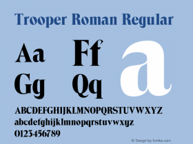
Trooper Roman, which was the basis for theToledotypeface used on this cover, was released by VGC in the early '70s. The typeface was fairly common in phototypesetting days (see this ad for Jim Beam, a campaign for jump suits, and a Christian paperback) but virtually disappeared from use by the '90s. This was likely due to changing fashions (high contrast, slightly wonky poster serifs gave way to Grunge and Neo-Classical type), but also because Trooper was hard to find in digital form. The availability of Toledo, a phototype follower of Trooper, alleviates that absence.
I disagree with Kidd, however, about the decision to use type like this for Dunham's cover. I think it's brilliant. It may not be "fresh, uncharted territory", but it will stand out on the shelf simply because it is so clearly of another time. No other title on the "New Books" display will be like it. And, more importantly, it fits Dunham's Lizzie Skurnick covers, which we've also covered here.
Read more about the design from CHIPS themselves.



-
 ShanhaiFonts
Brand:山海字库
Area:China

-
 Cangji Fonts
Brand: 仓迹字库
Area: China
-
 JT Foundry
Brand: 翰字铸造
Area: Taiwan, China

-
 Handmadefont
Brand:
Area: Estonia

-
·千图字体
-
 HyFont Studio
Brand: 新美字库
Area: China





- ·"Jesus Music" ad for Myrrh Records
- ·Bevésett nevek (Carved Names), vol. 2
- ·Alphabet Stories by Hermann Zapf
- ·Königsblut identity
- ·Ad for Vincebus Eruptum by Blue Cheer
- ·Cocoa Marsh Instant Fudge Candy Mix packaging
- ·Top 100 Fonts.com Web Fonts for May 2016
- ·Type terms: the animated typographic cheat sheet
- ·Iconic Transport for London logo undergoes subtle redesign
- ·Brother Moto Flat-Trackin' Tee