


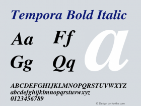
Peer Gynt book cover & vinyl record


Source: https://www.behance.net.Lars Høie. License: CC BY-ND.
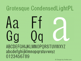
A contemporary typographic interpretation of the classic Norwegian play Peer Gynt.
Atreyu, by Greg Eckler, is a contemporary textura blackletter inspired by Gothic Illuminated Manuscripts of 14th century Germany. In the mid 19th century, when the play was written by Henrik Ibsen, blackletter was the dominant typographical style in Norway — the zeitgeist of the era. The textura stands in stark contrast to the contemporary geometric grotesque, LL Circular by Laurenz Brunner, not unlike the story of Peer Gynt itself.
The concept is based on the enormous ego of Peer Gynt, the main character. His ego is so big that it overshadows even the national icons Ibsen and Grieg. The size of Peer's ego is reflected in the size of the title which is too big to fit the material it's printed on.

Source: https://www.behance.net.Lars Høie. License: CC BY-ND.

Source: https://www.behance.net.Lars Høie. License: CC BY-ND.


-
 ShanhaiFonts
Brand:山海字库
Area:China

-
 Cangji Fonts
Brand: 仓迹字库
Area: China
-
 JT Foundry
Brand: 翰字铸造
Area: Taiwan, China

-
 Handmadefont
Brand:
Area: Estonia

-
·千图字体
-
 HyFont Studio
Brand: 新美字库
Area: China


- ·Make market-ready fonts with this 8 point checklist
- ·Chinese College Student Invents Smog Font
- ·Alphabet Stories by Hermann Zapf
- ·Antropofagia. Palimpsesto Selvagem
- ·"Die Alpen – Vielfalt in Europa" stamp
- ·Brother Moto Flat-Trackin' Tee
- ·Cocoa Marsh Instant Fudge Candy Mix packaging
- ·Hollywood Star Matt Damon Wrote Better Chinese than Chinese Stars
- ·Königsblut identity
- ·Benetton identity redesign