


David Spiller shows type-based art
typography in his exhibition at the Beaux Arts Gallery in London, opening this Wednesday." />
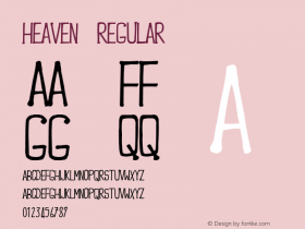
Artist David Spiller shows what you can do with a little graphic design training, displaying a series of bold, graphic canvases with an emphasis on typography in his exhibition at the Beaux Arts Gallery in London, opening this Wednesday.
Spiller describes his own work as "about colour and space"; onto this he adds bold colour and stencilled letters, which he then disrupts with a series of scribbled words, figures, doodles and other elements.
For this exhibition, titled Tryin' to get to Heaven Before They Close the Door, Spiller mines his record collection, using fragments of lyrics--some instantly recognizable, others less so--to create a collection of works that is romantic, idealistic, and instantly cheery. He also taps into key icons of popular culture, using cartoon characters.
Spiller is a long-established artist, who cut his teeth at graphic design school in the late 1950s and was a key figure on the art-school circuit of the 1960s.
His exhibition at Beaux Arts runs from September 9 to October 3.
Click here for more details and visiting information.


-
 ShanhaiFonts
Brand:山海字库
Area:China

-
 Cangji Fonts
Brand: 仓迹字库
Area: China
-
 JT Foundry
Brand: 翰字铸造
Area: Taiwan, China

-
 Handmadefont
Brand:
Area: Estonia

-
·千图字体
-
 HyFont Studio
Brand: 新美字库
Area: China


- ·Quimbaya Coffee Roasters
- ·20 Houses. A New Residential Landscape exhibition, Wallpaper* Architects Directory
- ·Sinnesreize / Embracing Sensation by Silvia Gertsch and Xerxes Ach
- ·Hollywood Star Matt Damon Wrote Better Chinese than Chinese Stars
- ·XUID Arrays: One Less Thing To Worry About
- ·Type terms: the animated typographic cheat sheet
- ·How to sell your typefaces
- ·Linotype Ad: "Linotype vs. Intertype"
- ·10 Top Romantic Fonts on Valentine's Day!
- ·Top 100 Fonts.com Web Fonts for May 2016