



"The pause that keeps you going – keeping a slim figure" Coca-Cola ad


Source: https://www.flickr.com.scanned and retouched by Paul Malon. License: All Rights Reserved.
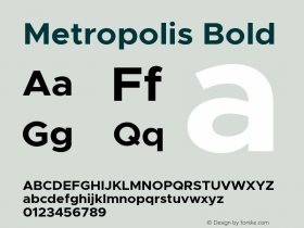
The bold typeface with the tiny x-height is the hohe ("tall") variety of Metropolis, designed by Willy Schwerdtner and cut by Gustav Eichenauer for Stempel in 1928. In the US,Metropoliswas available from Continental Type Founders Association and was advertised as "a series which through its contrasting weights and special long ascenders gives possibilities of effective advertising composition not previously obtainable". To my knowledge, none of the various digital versions offers the elongated caps and ascenders of Hohe Metropolis.
The smaller copy is in ATF Garamond. The Linotype version of this design was introduced in 1936 asGaramond No. 3. Note the 4-dot ellipsis in line 4 and the dissolved 'fi' ligature in the last line (there is one in line 2) — both decisions help justifying the short lines.





-
 ShanhaiFonts
Brand:山海字库
Area:China

-
 Cangji Fonts
Brand: 仓迹字库
Area: China
-
 JT Foundry
Brand: 翰字铸造
Area: Taiwan, China

-
 Handmadefont
Brand:
Area: Estonia

-
·千图字体
-
 HyFont Studio
Brand: 新美字库
Area: China





- ·Statement and Counter-Statement, Automatically Arranged Alphabets, and Arts/Rats/Star
- ·XUID Arrays: One Less Thing To Worry About
- ·The Future of Sex poster
- ·Chinese College Student Invents Smog Font
- ·Alibaba Supports Font Infringement Complaints
- ·Ad for Hello Dummy! by Don Rickles
- ·Cher Got Sued For Font!
- ·Top 100 Fonts.com Web Fonts for May 2016
- ·Königsblut identity
- ·Hollywood Star Matt Damon Wrote Better Chinese than Chinese Stars