


True Detective poster and title sequence


© HBO 2014. License: All Rights Reserved.
You can read an interview with the title sequence designers at Art of the Title. Unfortunately nothing about the typography is mentioned.
You don't see the Condensed width ofITC Avant Garde Gothicused very often. I can't confirm the serif, but I'm pretty sure it'sArno. The delicate hairlines of this calligraphic serif get lost in these small titles. The designers might have used the regular style of Arno and would probably have better luck with the sturdier Caption variant.
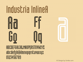
For the main title and poster, the late '90s, DINish, pseudo-grungeITC Conduitmakes a comeback as the gritty, oddball, industrial sans that it is. Conduit doesn't reveal its goofy side as long as you don't show its lowercase.

© HBO 2014. License: All Rights Reserved.

© HBO 2014. License: All Rights Reserved.

© HBO 2014. License: All Rights Reserved.

© HBO 2014. License: All Rights Reserved.

© HBO 2014. License: All Rights Reserved.

© HBO 2014. License: All Rights Reserved.

© HBO 2014. License: All Rights Reserved.

© HBO 2014. License: All Rights Reserved.

© HBO 2014. License: All Rights Reserved.

© HBO 2014. License: All Rights Reserved.


-
 ShanhaiFonts
Brand:山海字库
Area:China

-
 Cangji Fonts
Brand: 仓迹字库
Area: China
-
 JT Foundry
Brand: 翰字铸造
Area: Taiwan, China

-
 Handmadefont
Brand:
Area: Estonia

-
·千图字体
-
 HyFont Studio
Brand: 新美字库
Area: China


- ·Iconic Transport for London logo undergoes subtle redesign
- ·Type terms: the animated typographic cheat sheet
- ·Sinnesreize / Embracing Sensation by Silvia Gertsch and Xerxes Ach
- ·The Great Comic Book Heroes, by Jules Feiffer
- ·Quimbaya Coffee Roasters
- ·Surabaya Beat by Beat Presser, Afterhours Books
- ·Cocoa Marsh Instant Fudge Candy Mix packaging
- ·London Underground's iconic Johnston Sans typeface
- ·Cher Got Sued For Font!
- ·Bevésett nevek (Carved Names), vol. 2