



Wildcard


Source: http://www.subtraction.com.License: All Rights Reserved.
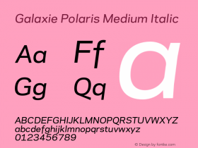
"Hopefully it's obvious that the mark is composed of three cards forming a W shape. But on a more subtle level, it's also meant to represent the promise of what we're trying to do at Wildcard: build a "third way" between today's mobile browsers, which offer great breadth but poor user experiences, and native apps, which offer rich user experiences but poor breadth and relatively cumbersome access. The middle card, the gold one, is meant to represent the Galaxie Polaris, which we've adopted as our official font family." — Khoi Vinh

Source: http://trywildcard.com.License: All Rights Reserved.


-
 ShanhaiFonts
Brand:山海字库
Area:China

-
 Cangji Fonts
Brand: 仓迹字库
Area: China
-
 JT Foundry
Brand: 翰字铸造
Area: Taiwan, China

-
 Handmadefont
Brand:
Area: Estonia

-
·千图字体
-
 HyFont Studio
Brand: 新美字库
Area: China





- ·"Jesus Music" ad for Myrrh Records
- ·Food Not Bombs hypothetical redesign
- ·Linotype Ad: "Linotype vs. Intertype"
- ·Sinnesreize / Embracing Sensation by Silvia Gertsch and Xerxes Ach
- ·Moving Hands (Helena Hauff Remix) by The Klinik, official video
- ·Barbe à papa Cotton Candy
- ·Chinese College Student Invents Smog Font
- ·The Form Book by Borries Schwesinger
- ·Once Upon DESIGN: New Routes for Arabian Heritage
- ·Surabaya Beat by Beat Presser, Afterhours Books