


US, The paperback magazine covers


Source: http://retrophile.co.License: All Rights Reserved.
Issue #1 front cover
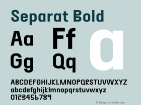
Project Projects explains this short-lived countercultural publication on the Design Envy blog:
Combining an underground press outlook and aesthetic with mass market distribution, US: A Paperback Magazine, was edited by Richard Goldstein and published by Bantam Books. US provided "all the news that's fit to eat" over a three-issue run from June 1969 through May 1970.
The Design Envy post also generously includes videos showing the internal contents of all 3 issues of the publication.
The interior design of each issue includes a bevy of other typefaces – perhaps the topic of a separate post.

Source: http://jellobiafrasays.tumblr.com.License: All Rights Reserved.
Issue #3 front cover

Source: http://www.ebay.com.License: All Rights Reserved.
Issue #1 spine

Source: http://ihavegoodbooks.blogspot.com.License: All Rights Reserved.
Issue #3 back cover

Source: http://retrophile.co.License: All Rights Reserved.
Issue #1 back cover

Source: http://www.philsp.com.License: All Rights Reserved.
Issue #2 front cover


-
 ShanhaiFonts
Brand:山海字库
Area:China

-
 Cangji Fonts
Brand: 仓迹字库
Area: China
-
 JT Foundry
Brand: 翰字铸造
Area: Taiwan, China

-
 Handmadefont
Brand:
Area: Estonia

-
·千图字体
-
 HyFont Studio
Brand: 新美字库
Area: China


- ·Barbe à papa Cotton Candy
- ·Bevésett nevek (Carved Names), vol. 2
- ·Food Not Bombs hypothetical redesign
- ·Troubadour poster, Opera Plovdiv
- ·Benetton identity redesign
- ·The Form Book by Borries Schwesinger
- ·20 Houses. A New Residential Landscape exhibition, Wallpaper* Architects Directory
- ·"Jesus Music" ad for Myrrh Records
- ·Statement and Counter-Statement, Automatically Arranged Alphabets, and Arts/Rats/Star
- ·How House Industries Designs Its Retrotastic Logos and Typefaces