


Tÿpo St. Gallen 2013 identity


Source: http://www.flickr.com.Photo: Florian Hardwig. License: CC BY-NC-SA.
In September 2013, the second edition ofNovelBold (Atlas Font Foundry, 2008).
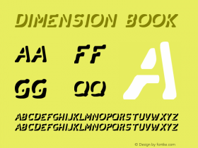
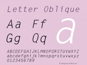
The letters 'T', 'y', 'p' and 'o' were used as decorative wayfinding elements in front of the venue — as a mobile hanging from a tree, and as floating styrofoam objects in a pond. A giant letter 'y' made for an impressive speaker's podium. For technical reasons, it had to lose its hallmark diaeresis in these dimensional applications.
Visual identity: TGG Hafen Senn Stieger
Speaker's podium and idea for dimensional styrofoam letters: Class for used on the conference website.

Source: http://www.flickr.com.Photo: Florian Hardwig. License: CC BY-NC-SA.

Source: http://www.flickr.com.Photo: Florian Hardwig. License: CC BY-NC-SA.

Source: http://www.flickr.com.Photo: Florian Hardwig. License: CC BY-NC-SA.


-
 ShanhaiFonts
Brand:山海字库
Area:China

-
 Cangji Fonts
Brand: 仓迹字库
Area: China
-
 JT Foundry
Brand: 翰字铸造
Area: Taiwan, China

-
 Handmadefont
Brand:
Area: Estonia

-
·千图字体
-
 HyFont Studio
Brand: 新美字库
Area: China


- ·Benetton identity redesign
- ·Sinnesreize / Embracing Sensation by Silvia Gertsch and Xerxes Ach
- ·"Die Alpen – Vielfalt in Europa" stamp
- ·Fonts Design of Childhood Memory
- ·Hollywood Star Matt Damon Wrote Better Chinese than Chinese Stars
- ·Food Not Bombs hypothetical redesign
- ·Moving Hands (Helena Hauff Remix) by The Klinik, official video
- ·New York New York, Jazz St. Louis
- ·Bevésett nevek (Carved Names), vol. 2
- ·Amazon Releases Ember Bold Font for the Kindle