



Bullitt Opening Title Sequence


License: All Rights Reserved.
Static images can only hint at the moody atmosphere of intrigue so deftly created by Pablo Ferro's Bullitt titles. You need to watch them in motion.
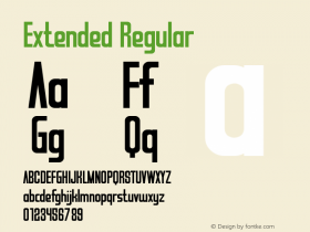
The main type isInformation Extra Bold Wide, an extension to the Information family, a group of sans serifs from the early 1900s. This particular stout weight was released in 1958, a decade before the release of Bullitt, but it still must have been hot stuff at the time. It still is today.
It's possible that Bullitt set a trend for heavy/wide sans serifs in crime thrillers. A variety of TV shows went with an extended Folio shortly after.
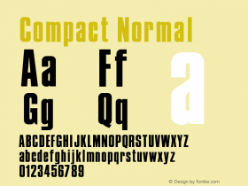
I can't positively identify the other type used in the sequence. They could be other styles of Information, or some of the many other narrow grots available at the time, such as Compacta, Neue Aurora, Anzeigen, or Plak.

License: All Rights Reserved.

License: All Rights Reserved.

License: All Rights Reserved.


-
 ShanhaiFonts
Brand:山海字库
Area:China

-
 Cangji Fonts
Brand: 仓迹字库
Area: China
-
 JT Foundry
Brand: 翰字铸造
Area: Taiwan, China

-
 Handmadefont
Brand:
Area: Estonia

-
·千图字体
-
 HyFont Studio
Brand: 新美字库
Area: China





- ·Cher Got Sued For Font!
- ·Type terms: the animated typographic cheat sheet
- ·"David Bowie is turning us all into voyeurs" button
- ·He Invented a Font to Help People With Dyslexia Read
- ·Fonts Design of Childhood Memory
- ·Japanese Typography Writing System
- ·Food Not Bombs hypothetical redesign
- ·Amazon Releases Ember Bold Font for the Kindle
- ·How to sell your typefaces
- ·Cocoa Marsh Instant Fudge Candy Mix packaging