



Futurama Opening Title Sequence


License: All Rights Reserved.
Main title animation from Season 1 (in SDTV).
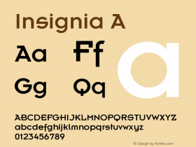
The opening titles for science fiction animation seriesITC KabelandInsignia. All these styles have a similar Art Deco influence as those typefaces found in Disney's Tomorrowland theme parks.
Why are Art Deco-inspired fonts so often employed for futuristic subject matter? Perhaps because the science fiction comic books and modernistic products of the 1920s–40s are the most endearing visual references to popular ideas of what the future might be. Or maybe it's simply that these geometric, mechanical designs reflect the kind of machine-made world we assume is inevitable.
In Futurama's case, the retro-futuristic titles are a callback to a pavilion at the 1939 New York World's Fair that inspired the series' name. Designed by Norman Bel Geddes, the GM's brochure for the attraction is set in Kabel, the predecessor to the ITC Kabel used in the TV series' credits.

License: All Rights Reserved.

License: All Rights Reserved.

License: All Rights Reserved.

License: All Rights Reserved.

License: All Rights Reserved.

License: All Rights Reserved.

License: All Rights Reserved.
Main title from later seasons in HDTV.




-
 ShanhaiFonts
Brand:山海字库
Area:China

-
 Cangji Fonts
Brand: 仓迹字库
Area: China
-
 JT Foundry
Brand: 翰字铸造
Area: Taiwan, China

-
 Handmadefont
Brand:
Area: Estonia

-
·千图字体
-
 HyFont Studio
Brand: 新美字库
Area: China





- ·MC5 – Back in the USA album cover
- ·Jim Nutt: Coming Into Character at Museum of Contemporary Art Chicago
- ·Statement and Counter-Statement, Automatically Arranged Alphabets, and Arts/Rats/Star
- ·XUID Arrays: One Less Thing To Worry About
- ·Quimbaya Coffee Roasters
- ·Cocoa Marsh Instant Fudge Candy Mix packaging
- ·Ad for Hello Dummy! by Don Rickles
- ·Antropofagia. Palimpsesto Selvagem
- ·"Die Alpen – Vielfalt in Europa" stamp
- ·"David Bowie is turning us all into voyeurs" button