


Streamline


Source: http://www.streamlineicons.com.Photo: Vincent le Moign. Webalys. License: All Rights Reserved. Artwork by Vincent le Moign.
Using the Morenita font for the logo, and the Lato font for the subheader
Lato perfectly matches the iOS7 style of the Streamline icon collection, especially when using the thinnest font weight. The iOS7 style is based on a thin monolinear style with slighty round corners and a lot of white space inside the icons.
That's why Lato, with its almost geometric style and a beautiful counterspace and generous aperture was a perfect companion for the icons. A great benefit of using Lato: it's provided via Google fonts. Most users would have it already downloaded in their browser cache when they visit the website, make it faster to load.
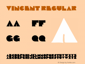
Morenita shares the same monolinear style but adds a retro touch, which is reminiscient of the streamline architectural style from the 1930s.

License: All Rights Reserved.

Photo: Vincent le Moign. License: All Rights Reserved. Artwork by Vincent le Moign.


-
 ShanhaiFonts
Brand:山海字库
Area:China

-
 Cangji Fonts
Brand: 仓迹字库
Area: China
-
 JT Foundry
Brand: 翰字铸造
Area: Taiwan, China

-
 Handmadefont
Brand:
Area: Estonia

-
·千图字体
-
 HyFont Studio
Brand: 新美字库
Area: China


- ·Königsblut identity
- ·Ad for Vincebus Eruptum by Blue Cheer
- ·Top 100 Fonts.com Web Fonts for May 2016
- ·Iconic Transport for London logo undergoes subtle redesign
- ·Japanese Typography Writing System
- ·The Future of Sex poster
- ·MC5 – Back in the USA album cover
- ·"Fantastic!" ad for Captain Fantastic & the Brown Dirt Cowboy by Elton John & Bernie Taupin
- ·"David Bowie is turning us all into voyeurs" button
- ·London Underground's iconic Johnston Sans typeface