



konkret, Issue 12/2013


Source: http://www.konkret-magazin.de.License: All Rights Reserved.
Typographic knee-jerk reactions, 1/2: Using blackletter to evoke Third Reich connotations.
The top story in the current issue of FF Brokenscript(1991). Of course, Just van Rossum's contemporary exploration of Fraktur letterforms has nothing to do with the Second World War propaganda nor the German schaftstiefelgrotesks of the mid 1930s. It is a "slightly ironic view of blackletter" (Jan Middendorp in Dutch Type) and "feels very contemporary and cool, rather than medieval and morbid" (FontFont). Reverting to a random blackletter for any allusion to Nazism is historically illiterate. It's a lame cliché that should be avoided.
See also this other — nicer — stereotypical use of FF Brokenscript.

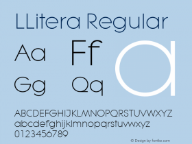
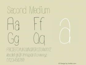
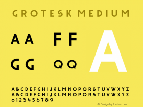



-
 ShanhaiFonts
Brand:山海字库
Area:China

-
 Cangji Fonts
Brand: 仓迹字库
Area: China
-
 JT Foundry
Brand: 翰字铸造
Area: Taiwan, China

-
 Handmadefont
Brand:
Area: Estonia

-
·千图字体
-
 HyFont Studio
Brand: 新美字库
Area: China


- ·Type terms: the animated typographic cheat sheet
- ·Brother Moto Flat-Trackin' Tee
- ·Linotype Ad: "Linotype vs. Intertype"
- ·London Underground's iconic Johnston Sans typeface
- ·Cocoa Marsh Instant Fudge Candy Mix packaging
- ·Food Not Bombs hypothetical redesign
- ·Iconic Transport for London logo undergoes subtle redesign
- ·20 Houses. A New Residential Landscape exhibition, Wallpaper* Architects Directory
- ·47 free tattoo fonts for your body art
- ·Why Apple Abandoned the World's Most Beloved Typeface?