


Reebok Logos, 1970s–2002


Source: http://www.famouslogos.us.License: All Rights Reserved.
This is a good overview of Reebok's logo history … with one obvious errror: it is not possible that Motter Tektura was used all the way back to the shoe company's founding in 1895 because the typeface wasn't designed until 1975.
Although Reebok hasn't used the typeface for over a decade, for many consumersMotter Tekturahas been the face of the shoe company since the 1970s. In 2002, the brand abandoned the typeface for their main logo, but does break it out with the Union Jack for their throwback product lines (shown below).

License: All Rights Reserved.
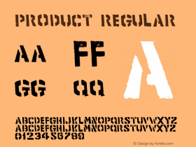
In 1986, Reebok dropped the Union Jack flag from their logo and replaced it with a triangle-swash symbol known as "the vector" inspired by the designs on the shoe sides. The new logo was used for approximately ten years.

Source: http://wellgosh.com.Palace X Reebok Workout Low. License: All Rights Reserved.

Source: http://wellgosh.com.Palace X Reebok CL. License: All Rights Reserved.

Source: http://sportswebupdates.blogspot.com.License: All Rights Reserved.
This Reebok logo was introduced sometime in the 1970s. It was later revised for the Reebok Classic Collection "a collection of products characterized by the brand's past".


-
 ShanhaiFonts
Brand:山海字库
Area:China

-
 Cangji Fonts
Brand: 仓迹字库
Area: China
-
 JT Foundry
Brand: 翰字铸造
Area: Taiwan, China

-
 Handmadefont
Brand:
Area: Estonia

-
·千图字体
-
 HyFont Studio
Brand: 新美字库
Area: China


- ·Make market-ready fonts with this 8 point checklist
- ·Antropofagia. Palimpsesto Selvagem
- ·10 Top Romantic Fonts on Valentine's Day!
- ·47 free tattoo fonts for your body art
- ·Alphabet Stories by Hermann Zapf
- ·"Fantastic!" ad for Captain Fantastic & the Brown Dirt Cowboy by Elton John & Bernie Taupin
- ·Jim Nutt: Coming Into Character at Museum of Contemporary Art Chicago
- ·"David Bowie is turning us all into voyeurs" button
- ·Moving Hands (Helena Hauff Remix) by The Klinik, official video
- ·Troubadour poster, Opera Plovdiv