


We Love Life by Pulp


Source: http://www.flickr.com.Image via Emmanuel Lodieu. License: All Rights Reserved.
For Pulp's final album in 2001, Peter Saville contrasted two very different typographic styles — intricate floral letters cut by hand into wood, and plastic label tape stamped by a machine.
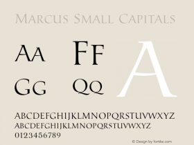
The large letters come from at least two designs (the 'P's are from different alphabets) in a decorative wood typeseriesby the Lettres Ombrées Ornées is a similar design but is based on a slab serif model and is much less varied in its ornamentation.
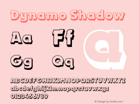
"We Love Life" is made not with a font, but with a labeler (such as aFF DynamoeandChromosome,
Printed credits:
Design: Howard Wakefield and Marcus Werner Hed
Art direction: Peter Saville and Jarvis Cocker

License: All Rights Reserved.

Source: http://www.flickr.com.Photo by Bas van Vuurde. License: All Rights Reserved.
According to PulpWiki, non-UK versions of the album have autumnal colors rather than green.

Source: http://rover.ebay.com.License: All Rights Reserved.
Australian promo poster using Chromosome.

Source: http://www.poprockposters.com.License: All Rights Reserved.
Promo poster using the FF Dynamoe font rather than physical label tape.

Source: http://rover.ebay.com.License: All Rights Reserved.
Swedish promo poster also using FF Dynamoe.


-
 ShanhaiFonts
Brand:山海字库
Area:China

-
 Cangji Fonts
Brand: 仓迹字库
Area: China
-
 JT Foundry
Brand: 翰字铸造
Area: Taiwan, China

-
 Handmadefont
Brand:
Area: Estonia

-
·千图字体
-
 HyFont Studio
Brand: 新美字库
Area: China


- ·He Invented a Font to Help People With Dyslexia Read
- ·How to sell your typefaces
- ·Bevésett nevek (Carved Names), vol. 2
- ·Surabaya Beat by Beat Presser, Afterhours Books
- ·Benetton identity redesign
- ·Chinese College Student Invents Smog Font
- ·20 Houses. A New Residential Landscape exhibition, Wallpaper* Architects Directory
- ·Top 100 Fonts.com Web Fonts for May 2016
- ·"David Bowie is turning us all into voyeurs" button
- ·Barbe à papa Cotton Candy