



字体设计基础(3)流线型
Fluent shapes. Designing type is like driving a car. If you drive a car, you always take the curve in a natural way. If you draw a curve (of a character) on paper, this is exactly the same. The curve starts smoothly, never out of a sudden. While driving a car, you don't start turning the wheel when you are already in the beginning of the curve. A while before you arrive in the curve you anticipate by leading your car gently in the right direction. Think about driving a car when you are sketching type on a paper.
流线型。设计字体就好比开车。你在开车的时候,总是会以自然的曲线过弯。当你在纸面上绘制一条曲线(或一个字符)的时候,也是同样的道理。曲线平缓地开始,而不是陡然出现。开车时,你不会在到达了弯道口之后才开始打方向盘,而是在你预计即将进入弯道的时候,就开始慢慢的将车引入正确的方向。当你在纸上画草图的时候,多想想你是怎样开车的。
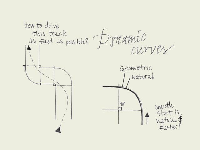
标题:动态的曲线
左:怎样才能最快的驶过这条弯道?
右1:几何曲线
右2:自然曲线
右下:平滑的开始转向,更自然,更快速!



-
 ShanhaiFonts
Brand:山海字库
Area:China

-
 Cangji Fonts
Brand: 仓迹字库
Area: China
-
 JT Foundry
Brand: 翰字铸造
Area: Taiwan, China

-
 Handmadefont
Brand:
Area: Estonia

-
·千图字体
-
 HyFont Studio
Brand: 新美字库
Area: China





- ·Quimbaya Coffee Roasters
- ·Brother Moto Flat-Trackin' Tee
- ·Top 100 Fonts.com Web Fonts for May 2016
- ·Ad for Vincebus Eruptum by Blue Cheer
- ·47 free tattoo fonts for your body art
- ·How House Industries Designs Its Retrotastic Logos and Typefaces
- ·The Great Comic Book Heroes, by Jules Feiffer
- ·The Form Book by Borries Schwesinger
- ·Alphabet Stories by Hermann Zapf
- ·Make market-ready fonts with this 8 point checklist